ggplot(cu_wq, aes(year_frac, result)) +
  geom_point(alpha = 0.5) +
  geom_smooth(se = FALSE) +
  labs(title = "Total Copper — raw scale", y = "Copper (µg/L)") +
  nlt_theme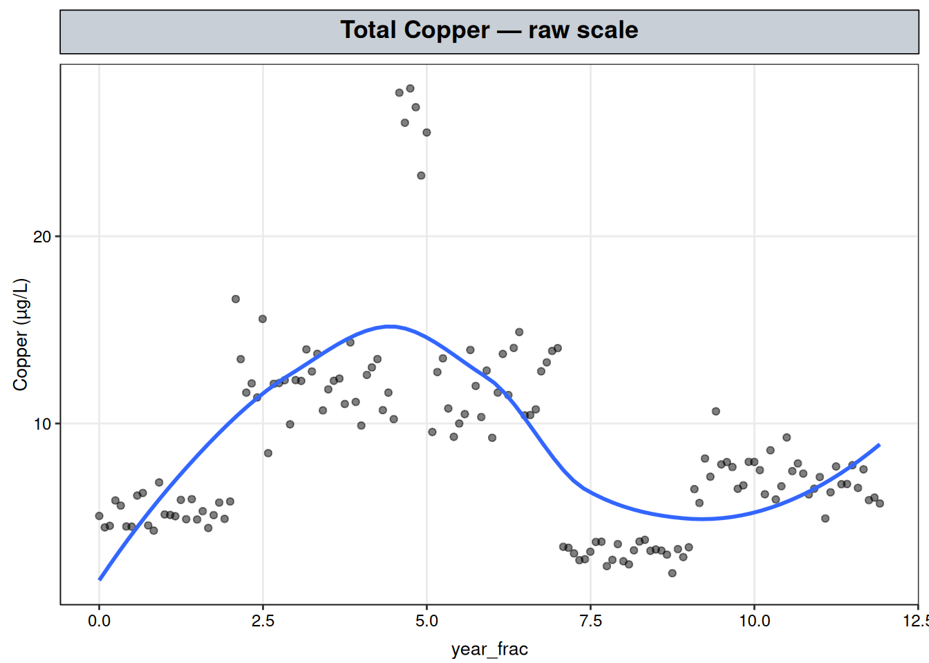
Total Copper — step-like, non-monotonic change with no fixed pattern
Total Copper has a shape with no apparent periodic structure and no small set of knots an analyst would confidently place by eye, which rules out the methods used so far: piecewise regression assumes flat-then-sloped segments and changepoint detection assumes a single level jump.
In the next chapter, GAMM (on Dissolved Oxygen), we’ll build for a repeating annual shape with a correlated-noise problem, which is not relevant here.
It also doesn’t offer the move Post-Diagnosis: Committing to a Parametric Form makes for Total Phosphorus — there’s no recognizable family (logistic, exponential, or otherwise) this shape resolves into, so there’s no simpler curve to commit to afterward.
This is the case a generalized additive model (GAM) is built for: a curve shape too irregular to describe with a handful of hand-picked segments or knots in a linear combination, and too irregular to hand off to a parametric family either. The record still needs an answer to a concrete question — is this concentration currently rising, falling, or holding — and a GAM is what turns that into a testable claim rather than a read off a noisy plot.
The Regression Framework makes the point that “linear” describes the parameters, not the shape. Three models build on each other to show what that means in practice:
OLS is a sum of two fixed pieces of \(x\), each multiplied by its own coefficient and added in:
\[y = \underbrace{\beta_0}_{\text{intercept basis: } 1} + \underbrace{\beta_1 x}_{\text{slope basis: } x}.\]
Each of those pieces — \(1\), \(x\) — is a basis function: a fixed function of \(x\) that gets multiplied by a coefficient and added into the model. An OLS fit is already a sum of two of them.
Piecewise regression adds a third, hand-picked basis function: a hinge that bends at a single point \(c\) the analyst chose:
\[y = \underbrace{\beta_0}_{\text{intercept basis}} + \underbrace{\beta_1 x}_{\text{slope basis}} + \underbrace{\beta_2 (x - c)_+}_{\text{hinge basis}}.\]
It’s still just a coefficient times a fixed function of \(x\), added in — the pattern Transformations names feature-engineering the regressor: handing lm() one new column instead of reaching for a response transform.
A GAM is the same move again, scaled up and automated. Instead of one or two hand-picked basis functions like the hinge term, it uses many small, fixed, curved ones, with a fitted penalty — not the analyst — deciding how much of that flexibility survives.
A spline is a single curve built from many local pieces stitched together smoothly, rather than one global formula or a small number of hand-placed hinges: each piece only shapes the curve over a short stretch of \(x\), and neighboring pieces are constrained to meet without a kink, so the whole curve can bend differently in different regions without any one region’s shape being chosen by the analyst.
The pieces themselves are basis functions, the same kind of object as the hinge term above, just more of them and smaller:
\[b_1(x), \dots, b_k(x),\]
each shaping only a short local stretch of \(x\), and none of them placed by the analyst — mgcv::gam() constructs the set. That set is called a spline basis, and the fitted spline curve is the sum of those basis functions, each weighted by its own coefficient:
\[f(x) = \sum_{m=1}^{k} \beta_m b_m(x).\]
This sum can trace out almost any smooth curve, but the expression is still a linear combination of fixed terms, exactly like the OLS and piecewise sums above. What’s new is that a fitted penalty, not an analyst placing knots by eye, decides how much of that flexibility survives.
A GAM’s linear predictor is \(\eta = \beta_0 + f(x)\), with \(f\) the spline-basis sum above standing in for the single coefficient times \(x\) an OLS fit would use. mgcv::gam() constructs a rich basis (up to k candidate knots) and a fitted smoothing penalty decides how much of that flexibility survives, shrinking toward a straight line wherever the data doesn’t support the extra wiggle.
Fitting isn’t just least squares on the basis columns. Instead, the coefficients \(\beta_1, \dots, \beta_k\) are chosen to minimize a single criterion, the penalized sum of squares:
\[\mathrm{PSS} = \underbrace{\sum_{i=1}^n \left(y_i - f(x_i)\right)^2}_{\text{lack of fit}} + \; \lambda \underbrace{\int f''(x)^2\,dx}_{\text{roughness}}.\]
The first term is ordinary squared error, the same quantity OLS minimizes on its own — it gets smaller the closer the fitted curve \(f(x_i)\) tracks each observed \(y_i\). The second term, the roughness penalty, is large when \(f\) bends sharply and zero when \(f\) is a straight line, since a line has zero second derivative everywhere; it’s what stops the fit from chasing every observation exactly, which an unpenalized k-knot basis could otherwise do. \(\lambda\) sets the exchange rate between the two: \(\lambda \to 0\) lets the fit use as much of the basis’s flexibility as it wants and behave like unpenalized regression on that basis, \(\lambda \to \infty\) forces \(f\) back to a straight line regardless of what the basis could represent. method = "REML" below estimates \(\lambda\) from the data itself, rather than fixing it or choosing it by eye.
The penalty above decides how much of the basis’s flexibility survives, but that decision needs to be reportable as a single number — something to put in a results table next to the smooth term, the way an OLS fit reports one slope. That number is the effective degrees of freedom (edf), and it’s what summary() prints beside every smooth term fit on this site, including fit_cu below.
For this purpose, edf is a curvature dial: edf ≈ 1 means the penalty squeezed the smooth back to essentially a straight line, and edf ≈ k means the penalty let it use nearly all the flexibility the basis allows. Reading it off a fit says, in one number, how much curvature survived. (Formally it’s the trace of the model’s influence matrix at the fitted \(\lambda\) — see Wood, 2017, §6.1.2, for the full definition — but the dial reading above is what matters for interpreting a fit.)
The basis dimension k caps how wiggly the fit is allowed to get; the fitted penalty decides how much of that allowance actually gets used, based on the data. That makes a GAM’s flexibility data-driven, sitting between a fixed parametric form (piecewise regression, with its hand-placed hinge) and no form at all (k-NN, LOESS, with no coefficients at all).
The fitted smooth carries an edf and a significance test that answers a concrete question: is this smooth distinguishable from flat at all. That’s the same kind of reportable number a slope or a breakpoint gives elsewhere in this vignette, and it’s what turns “is this concentration currently rising, falling, or holding” into an answerable, testable question below, rather than a read off a noisy plot.
ggplot(cu_wq, aes(year_frac, result)) +
geom_point(alpha = 0.5) +
geom_smooth(se = FALSE) +
labs(title = "Total Copper — raw scale", y = "Copper (µg/L)") +
nlt_theme
An early low, stable period; a rise to a higher plateau; a brief spike well above that; a drop back down; a further drop below the original level; and a partial recovery — none of it periodic, none of it a straight line or two. The smoothed curve above is itself a LOESS fit — ggplot2’s default smoother at this data size — used here the same informal way k-NN and LOESS are used deliberately for Total Phosphorus: to see the shape before deciding what to do with it. Here, that pass doesn’t resolve into any recognizable family the way Total Phosphorus’s did — there’s no logistic, exponential, or other simple curve this traces out — which is why this chapter reaches for a GAM instead of a parametric fit.
# same smooth term, fit once on each scale, to see which one produces
# constant-variance residuals
# bs = "tp": thin-plate regression spline, mgcv's general-purpose default basis
# method = "REML": estimate the smoothing penalty lambda from the data (see "How the smoothing penalty is fit" above)
fit_check_log <- gam(log(result) ~ s(year_frac, bs = "tp", k = 20), data = cu_wq, method = "REML")
fit_check_raw <- gam(result ~ s(year_frac, bs = "tp", k = 20), data = cu_wq, method = "REML")
bptest(lm(resid(fit_check_log) ~ fitted(fit_check_log)))
    studentized Breusch-Pagan test

data:  lm(resid(fit_check_log) ~ fitted(fit_check_log))
BP = 0.093648, df = 1, p-value = 0.7596bptest(lm(resid(fit_check_raw) ~ fitted(fit_check_raw)))
    studentized Breusch-Pagan test

data:  lm(resid(fit_check_raw) ~ fitted(fit_check_raw))
BP = 39.602, df = 1, p-value = 3.114e-10
Total Copper is a concentration, so the usual dilution/loading argument for logging applies, and the check confirms it: the raw-scale fit fails Breusch-Pagan decisively (\(p = 3.1\times10^{-10}\)), the log-scale fit doesn’t (\(p = 0.760\)). log(result) is used from here on.
k only sets a ceiling on the basis’s flexibility — it doesn’t by itself guarantee the ceiling is high enough for this record’s sharpest transitions. mgcv::k.check() tests exactly that, by checking whether the fitted smooth’s residuals still show pattern a larger basis could have absorbed:
# k = 20 as a starting basis size; k.check() below tests whether it's a tight ceiling
fit_cu_k20 <- gam(log(result) ~ s(year_frac, bs = "tp", k = 20), data = cu_wq, method = "REML")
set.seed(1) # k.check()'s p-value comes from a random resampling test, not a closed form
k.check(fit_cu_k20)
k' edf k-index p-value
s(year_frac) 19 16.80328 0.8044481 0.0075A k-index below 1 paired with a small p-value is mgcv’s signal that k = 20 is not quite large enough: the basis is capped a little before the penalty gets to decide anything.
k.check() only answers one question — is the ceiling too tight — and stops mattering the moment the answer is no. It says nothing about which of the values that clear it actually fits best, so the next step is a small sweep past the point where the check first passes, tracking AIC and deviance explained alongside the k-index:
# candidate k values spanning "just clears k.check()" to "well past it"
k_candidates <- c(20, 25, 30, 40, 60)
set.seed(1) # k.check()'s p-value comes from a random resampling test, not a closed form
k_sweep <- lapply(k_candidates, function(k) {
  fit <- gam(log(result) ~ s(year_frac, bs = "tp", k = k), data = cu_wq, method = "REML")
  kc <- k.check(fit)
  data.frame(
    k = k,
    edf = summary(fit)$edf,
    k_index = kc[1, "k-index"],
    k_p_value = kc[1, "p-value"],
    AIC = AIC(fit),
    dev_expl = summary(fit)$dev.expl
  )
}) |> bind_rows()

k_sweep
k edf k_index k_p_value AIC dev_expl
1 20 16.80328 0.8044481 0.0075 -84.97436 0.9122720
2 25 20.39515 0.9574829 0.2650 -105.90142 0.9279755
3 30 22.79652 1.0237194 0.5800 -112.25363 0.9334639
4 40 25.71310 1.0925647 0.8350 -117.95882 0.9387685
5 60 27.13015 1.1062340 0.8950 -117.96063 0.9400442k = 25 is the narrowest value that clears k.check(), but AIC and deviance explained keep improving past it, through k = 30, and only flatten out at k = 40: AIC barely moves between k = 40 and k = 60 (edf still creeps up a little, from 25.7 to 27.1, but with no payoff in fit quality). That plateau, not the check’s p-value threshold, is the actual stopping point: it’s where the basis has enough room that the penalty is deciding the shape, not the ceiling. k = 40 is used from here on:
# k = 40: past where k.check() first clears, at the point AIC/edf stop improving per the sweep above
fit_cu <- gam(log(result) ~ s(year_frac, bs = "tp", k = 40), data = cu_wq, method = "REML")
summary(fit_cu)
Family: gaussian
Link function: identity

Formula:
log(result) ~ s(year_frac, bs = "tp", k = 40)

Parametric coefficients:
            Estimate Std. Error t value Pr(>|t|)
(Intercept)  2.01494    0.01216   165.7   <2e-16 ***
---
Signif. codes:  0 '***' 0.001 '**' 0.01 '*' 0.05 '.' 0.1 ' ' 1

Approximate significance of smooth terms:
               edf Ref.df    F p-value
s(year_frac) 25.71  30.73 57.6  <2e-16 ***
---
Signif. codes:  0 '***' 0.001 '**' 0.01 '*' 0.05 '.' 0.1 ' ' 1

R-sq.(adj) =  0.925   Deviance explained = 93.9%
-REML = -20.892 Scale est. = 0.021292 n = 144set.seed(1) # k.check()'s p-value comes from a random resampling test, not a closed form
k.check(fit_cu) k' edf k-index p-value
s(year_frac) 39 25.7131 1.092565 0.84With k = 40, the k-index is comfortably above 1 (\(p = 0.84\)) — no residual pattern left over that the basis can’t reach, and by a wider margin than k = 25 gave (\(p = 0.27\) there). The fitted edf of 25.7 out of a maximum of 39 shows the penalty is using roughly two thirds of the available flexibility rather than all of it, consistent with the AIC plateau in the sweep above: the extra basis capacity beyond k = 40 isn’t being used because the penalty doesn’t need it, not because the ceiling is still binding. The smooth term remains significant by a wide margin (\(p < 2\times10^{-16}\)).
# 300-point grid spanning the record, for a smooth prediction curve
grid <- data.frame(year_frac = seq(min(cu_wq$year_frac), max(cu_wq$year_frac), length.out = 300))
pred <- predict(fit_cu, newdata = grid, se.fit = TRUE)
grid <- grid |>
  mutate(
    fit = pred$fit,
    # band built on the log scale (where the fit's errors are ~Gaussian), then exponentiated
    lower = exp(fit - 1.96 * pred$se.fit),
    upper = exp(fit + 1.96 * pred$se.fit),
    fit = exp(fit)
  )

ggplot() +
  geom_point(data = cu_wq, aes(year_frac, result), alpha = 0.4, color = "grey40") +
  geom_ribbon(data = grid, aes(year_frac, ymin = lower, ymax = upper), fill = "steelblue", alpha = 0.25) +
  geom_line(data = grid, aes(year_frac, fit), color = "steelblue", linewidth = 1) +
  labs(title = "Total Copper — fitted GAM with 95% confidence band", y = "Copper (µg/L)") +
  nlt_theme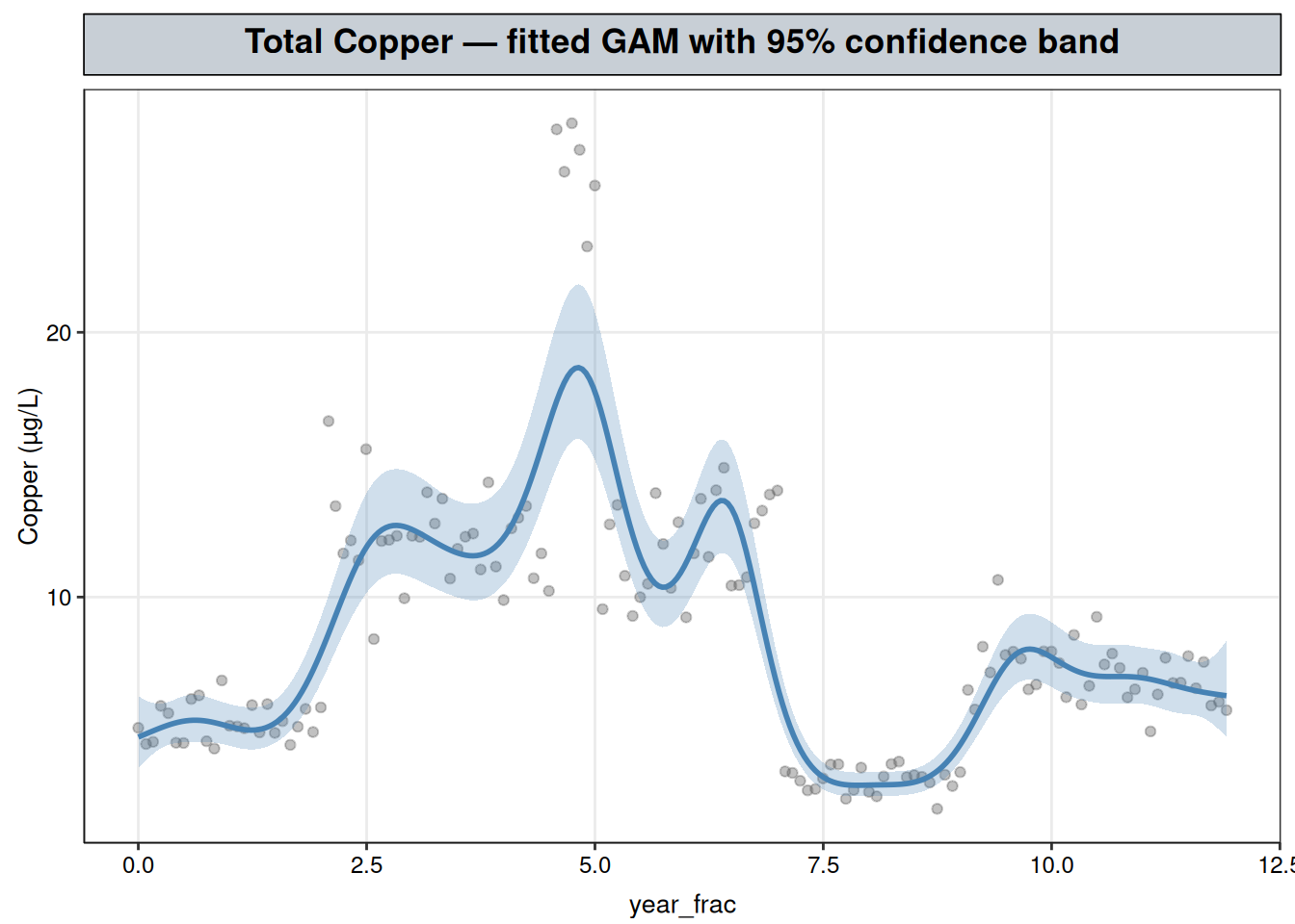
predict(fit_cu, se.fit = TRUE) returns a standard error alongside the fitted value at every point, the same as predict.lm() would, because the smooth term is a fitted linear combination of coefficients with a covariance matrix, the same machinery lm() relies on for its own confidence intervals. That covariance is propagated through exp() for the raw-scale band shown here. The band widens over the brief spike around year 4.5–5, where only a few months of data inform that stretch of the curve, and the fitted peak (about 20.8 µg/L) sits below the highest individual raw readings there — a short, few-month excursion is exactly what a smoothing penalty will partly discount, since a spike consistent with only a handful of points is harder to distinguish from noise than a shift that persists across many.
A single edf and p-value confirm the smooth term overall departs from flat, but they only speak to the record as a whole. They say nothing about where the record is moving in a given direction, which is the question a regulator actually asks. That question is answered by the derivative of the fitted curve — its local slope — and a confidence interval on that derivative, estimated by finite differences: nudge the fitted curve forward and backward by a small step, take \((\hat y(t+h) - \hat y(t-h))/2h\) as the local slope, and get its standard error from predict(..., type = "lpmatrix").
The lpmatrix is the “prediction matrix” \(X_p\) that maps the model’s coefficients onto linear-predictor values at any set of points, so \(X_p\hat\beta\) reproduces predict(fit) directly and, for any linear combination of predictions defined by a row vector \(d\), \(\mathrm{Var}(d^\top X_p \hat\beta) = d^\top X_p \, \mathrm{vcov}(\text{fit}) \, X_p^\top d\) (Wood, 2017, §7.2.6) — the same propagation used below with \(d\) built from the forward- and backward-shifted rows of \(X_p\) instead of a single contrast.
h <- 1e-3
# lpmatrix at year_frac +/- h, so each row's finite difference gives that point's local slope
Xp_plus  <- predict(fit_cu, newdata = data.frame(year_frac = grid$year_frac + h), type = "lpmatrix")
Xp_minus <- predict(fit_cu, newdata = data.frame(year_frac = grid$year_frac - h), type = "lpmatrix")
D <- (Xp_plus - Xp_minus) / (2 * h)

beta <- coef(fit_cu)
Vp <- vcov(fit_cu)
deriv <- as.numeric(D %*% beta)
# per-point SE via the delta-method propagation in the text above: Var(D %*% beta) row by row
se <- sqrt(rowSums((D %*% Vp) * D))

grid <- grid |>
  mutate(
    deriv_lower = deriv - 1.96 * se,
    deriv_upper = deriv + 1.96 * se,
    # a point counts as rising/falling only if its whole CI clears zero, not just its point estimate
    trend = case_when(
      deriv_lower > 0 ~ "rising",
      deriv_upper < 0 ~ "falling",
      TRUE ~ "flat"
    )
  )

table(grid$trend)
falling    flat  rising
     34     220      46
The 300 grid points span the record at roughly two-week intervals, so each count above is a share of the full ~12-year record classified by trend direction, not a slope magnitude: 220 points (73%, ~8.7 years) fall in stretches classified “flat” — the local slope’s CI didn’t clear zero there — while 46 points fall in stretches classified “rising” and 34 in stretches classified “falling”, where it did. That most of the record lands in “flat” is expected: the shape below is long stable stretches punctuated by short, sharp rises and falls, and it’s exactly those short stretches the classification is built to isolate rather than average away.
# each grid row paired with the next, to draw the curve as colored segments rather than points
grid_seg <- grid |>
  mutate(year_frac_end = lead(year_frac), fit_end = lead(fit)) |>
  filter(!is.na(year_frac_end))

trend_colors <- c(rising = "#2E7D32", falling = "#C62828", flat = "grey55")

ggplot() +
  geom_point(data = cu_wq, aes(year_frac, result), alpha = 0.35, color = "grey40") +
  geom_segment(
    data = grid_seg,
    aes(x = year_frac, y = fit, xend = year_frac_end, yend = fit_end, color = trend),
    linewidth = 1.1
  ) +
  scale_color_manual(values = trend_colors, name = "local trend") +
  labs(title = "Total Copper — fitted trajectory by significance of local slope", y = "Copper (µg/L)") +
  nlt_theme +
  theme(legend.position = "right")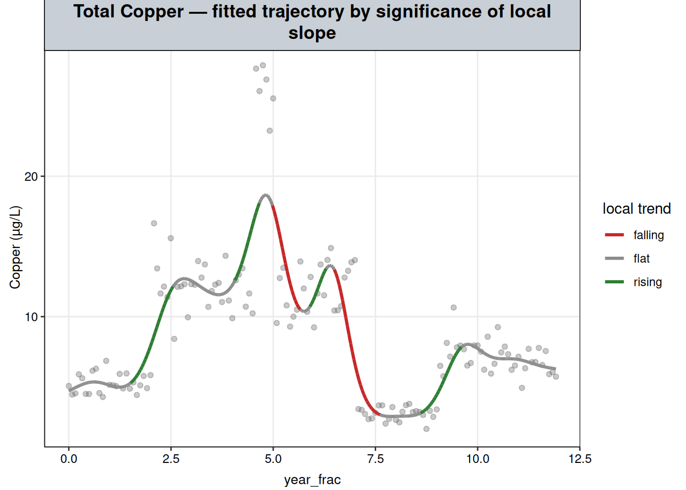
The coloring tracks the shape described from the raw plot, but now with each stretch labeled by whether the change is statistically distinguishable from flat: a significant rise onto the first plateau, a significant further rise into the spike, a significant fall back down, a significant fall below the original baseline, a significant partial recovery, and flat stretches — not significantly different from zero slope — everywhere the record is actually holding at a level rather than moving. That’s the concrete answer to “is it currently getting better or worse”: at any point on this record, the color at that point is a tested answer, not a visual impression.
bptest(lm(resid(fit_cu) ~ fitted(fit_cu)))
    studentized Breusch-Pagan test

data:  lm(resid(fit_cu) ~ fitted(fit_cu))
BP = 0.66584, df = 1, p-value = 0.4145shapiro.test(resid(fit_cu))
    Shapiro-Wilk normality test

data:  resid(fit_cu)
W = 0.99364, p-value = 0.7763
Both tests fail to reject their null: the Breusch-Pagan test (\(p = 0.415\)) finds no evidence of heteroscedasticity, and the Shapiro-Wilk test (\(p = 0.776\)) finds no evidence of non-normal residuals, on the log scale settled on above.
The GAM’s own F-test on the smooth term rests on the same independence assumption as any OLS-family test, so it’s worth checking rather than assuming it.
acf(resid(fit_cu), main = "Total Copper GAM — residual autocorrelation")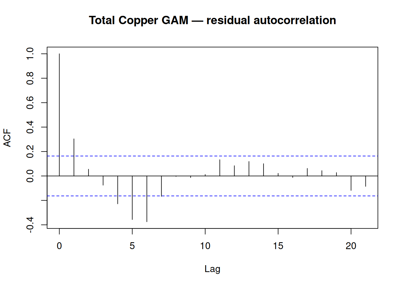
Box.test(resid(fit_cu), lag = 1, type = "Ljung-Box")
    Box-Ljung test

data:  resid(fit_cu)
X-squared = 1.0799, df = 1, p-value = 0.2987
This comes out as clean as the piecewise and changepoint chapters on this front: lag-1 autocorrelation is close to zero, and the Ljung-Box test finds no evidence against independence (\(p = 0.299\)).
cu_wq |>
  mutate(resid = resid(fit_cu)) |>
  ggplot(aes(year_frac, resid)) +
  geom_point(alpha = 0.5) +
  geom_hline(yintercept = 0, linetype = "dashed") +
  labs(title = "Total Copper GAM — residuals over time", y = "residual (log scale)") +
  nlt_theme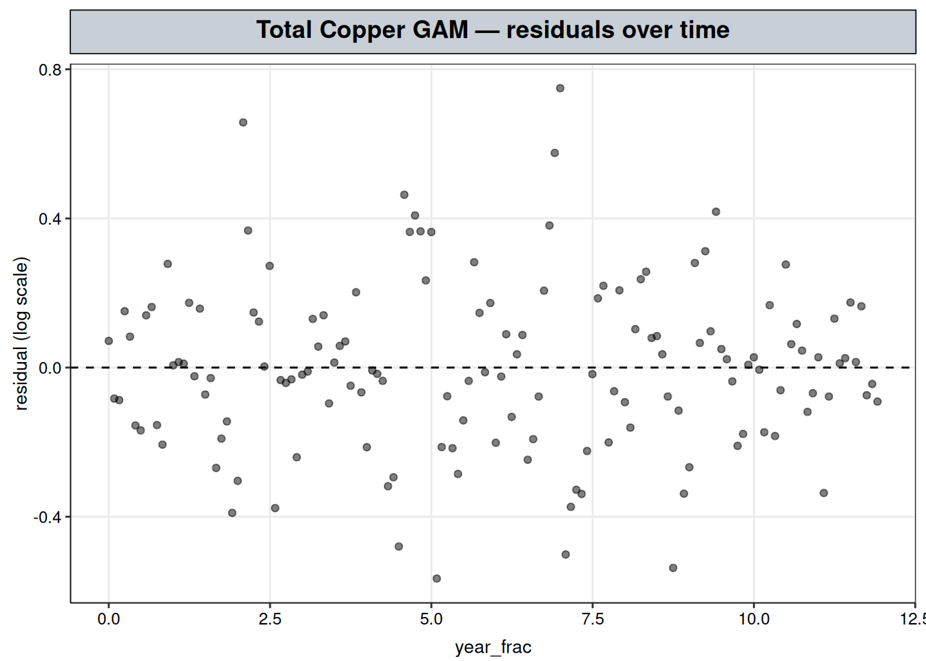
Plotted against time, the residuals are fairly evenly spread across the record.
The GAM’s spline basis is still feature engineering handed to a linear fit, the same category of move as Piecewise Regression’s hand-built hinge term. Unlike Dissolved Oxygen’s clean annual cycle (next chapter), though, there’s no sin/cos shortcut here — nothing about a step-and-spike pattern is periodic. The honest OLS alternative is a plain polynomial in year_frac, tried at increasing degree:
# escalating polynomial degree as the honest OLS attempt to match the GAM's flexibility
poly_fits <- lapply(c(4, 8, 12, 16), function(deg) lm(log(result) ~ poly(year_frac, deg), data = cu_wq))

data.frame(
  model = c(sprintf("OLS, degree-%d polynomial", c(4, 8, 12, 16)), "GAM"),
  AIC = c(sapply(poly_fits, AIC), AIC(fit_cu)),
  R2_or_dev_explained = c(sapply(poly_fits, function(f) summary(f)$r.squared), summary(fit_cu)$dev.expl)
)
model AIC R2_or_dev_explained
1 OLS, degree-4 polynomial 138.77952 0.5014007
2 OLS, degree-8 polynomial 21.78450 0.7906972
3 OLS, degree-12 polynomial -15.14373 0.8467945
4 OLS, degree-16 polynomial -31.46908 0.8706070
5 GAM -117.95882 0.9387685Even at degree 16, the polynomial’s \(R^2\) (0.87) and AIC (\(-31.5\)) both trail the GAM’s (0.94 deviance explained, AIC \(-118.0\)) by a wide margin, and the gap isn’t closing quickly as degree increases. The reason is structural: a polynomial term is global — every coefficient shapes the curve’s behaviour everywhere, so fitting a sharp local step or spike well tends to distort the fit far away from it, or costs an escalating number of parameters trying not to. A spline basis is local — each basis function’s influence is confined to a neighborhood of its knot, so representing one sharp transition doesn’t fight with representing another one elsewhere in the record. That locality, not just a higher effective degree, is what a hand-built polynomial feature can’t reproduce no matter how high its degree goes.
Total Copper moved through five distinct, individually significant phases over the twelve-year record: each stretch was tested, not eyeballed, via the derivative-significance plot above, and none of it describable by a straight line, a single knot, or a periodic function.
The GAM’s smoothing penalty found this shape without being told any of it in advance, using only a smoothness assumption, and a degree-16 polynomial handed every opportunity to match it still fell well short — the concrete case, in this vignette, for reaching past a fixed parametric form when a series’ shape isn’t known ahead of time.
For a regulator asking “is this currently a problem,” the record closes on the flat, partially-recovered plateau rather than the elevated spike, which is a materially different answer than either the raw high-water mark or a single straight-line trend fit to the whole record would give.
s(year_frac) alone is the single-predictor case; a GAM’s real strength shows up once more than time is believed to drive the analyte. If a plausible confound exists — flow, a co-occurring pollutant, an upstream operational variable — the natural extension is a multi-predictor GAM, s(year_frac) + s(flow) or similar, which lets each smooth absorb its own share of the variation instead of forcing everything through a single time trend the way this chapter does. The same machinery generalizes to multiple monitoring sites too, via a by-factor smooth (s(year_frac, by = site)) that lets the fitted shape differ across sites while still sharing one model, rather than fitting each site’s record separately the way this single-composite-site case study does.