ggplot(do_wq, aes(year_frac, result)) +
  geom_point(alpha = 0.5) +
  geom_smooth(se = FALSE) +
  labs(title = "Dissolved Oxygen — raw scale", y = "DO (mg/L)") +
  nlt_theme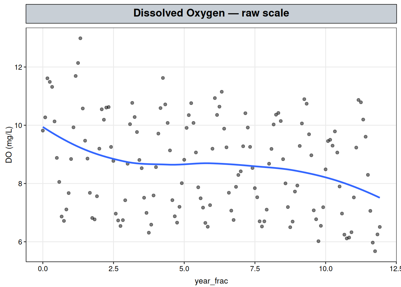
Dissolved Oxygen — checking whether the GAM’s significance test can be trusted
A plain GAM fit to Dissolved Oxygen’s trend and season looks convincing on its own: a wiggly, edf-3.85 decline with a strongly significant F-test. Checking one more thing first — whether the residuals behind that test are actually independent — changes the answer. Once the autocorrelation they contain is modeled explicitly instead of ignored, the same trend term collapses to a straight line, still significant, but far simpler than the naive fit implied.
That difference is this chapter’s real subject, not a side detail. A GAM’s significance test assumes independent residuals the same way OLS does, and a regularly sampled monitoring record with a seasonal cycle is exactly the kind of series where that assumption tends to fail quietly, without the fit ever throwing an error. Catching it here is what turns “Dissolved Oxygen looks like it’s dropping” into a claim worth putting in front of a regulator or client: the decline is real, it proceeds at a knowable, roughly constant rate, and it can be told apart from both the seasonal swing and the correlated noise riding along with it. The rest of this chapter builds that claim step by step — diagnosing the autocorrelation, fitting a corrected model, and confirming the correction actually did its job.
The GAM chapter fit Total Copper’s irregular shape with a single smooth term, s(year_frac), and read its significance test — an F-test behind an edf and a p-value — at face value. That test rests on an assumption: the residuals are independent draws, the same assumption ordinary least squares makes. Total Copper’s residuals passed that check (lag-1 autocorrelation close to zero, Ljung-Box \(p = 0.299\)), so taking the test at face value there was defensible.
This chapter works through an analyte, Dissolved Oxygen (DO), whose residuals don’t pass that check, and navigates what to do about it — with the same goal as the rest of this site: inference on the observed record, not forecasting.
ggplot(do_wq, aes(year_frac, result)) +
geom_point(alpha = 0.5) +
geom_smooth(se = FALSE) +
labs(title = "Dissolved Oxygen — raw scale", y = "DO (mg/L)") +
nlt_theme
An annual saw-tooth rides on top of what looks like a slight downward drift, though the seasonal swing is large enough that the drift is hard to judge by eye — exactly the kind of shape worth checking for autocorrelation directly, rather than assuming the independence behind a GAM’s significance test just holds.
Start with the plain single-term model the GAM chapter’s approach would produce here — one smooth in year_frac, nothing else — and look at what its residuals leave behind:
fit_single <- gam(log(result) ~ s(year_frac, bs = "tp", k = 10), data = do_wq, method = "REML")
acf(resid(fit_single), main = "Residual autocorrelation, trend-only GAM")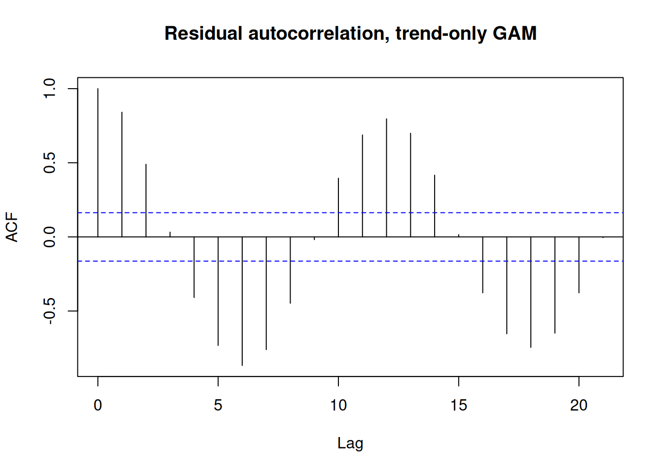
Autocorrelation is what it looks like when the independence assumption fails: one observation’s residual is predictable from a nearby one’s, rather than the two being independent draws. Formally, it’s the correlation between a residual series and a lagged copy of itself — residual at time \(t\) against residual at time \(t-1\), \(t-2\), and so on, plotted at each lag above via acf().
Here it doesn’t just decay, it oscillates: strongly positive at lag 1 (0.84), swinging down through zero to a trough around lag 6 (-0.87), then back up to a second peak around lag 12 (0.80) — observations six months apart move in opposite directions, observations twelve months apart move together again. That’s the signature of an annual cycle, not generic short-range noise.
s(year_frac) has no variable to represent “month of year” with, so the seasonal swing doesn’t disappear, it just relocates into the residuals as this lag-12 correlation pattern. An ACF plot like this one is doing double duty: it’s evidence the independence assumption is shaky, the same role it plays later in this chapter, but read together with the record’s raw shape, it’s also a pointer toward what’s missing — a periodic regressor — rather than just a generic warning that something’s wrong.
A repeating annual cycle riding on a slow drift, with correlated noise on top, is a familiar shape in time-series analysis generally, and several established approaches exist for it. Which one applies here comes down to what the deliverable needs to be:
stl() decomposes it descriptively (used later in this chapter as a cross-check). None of the three is built to hand back a significance test on a smooth trend term the way this chapter needs — they’re forecasting or descriptive tools, not inferential ones in the sense the rest of this site uses.The GAM chapter answered a version of this same problem for Total Copper: a curve too irregular to fit with a hand-picked polynomial or hinge term, so it reached for a spline basis instead — many small basis functions built by mgcv::gam(), with a fitted penalty rather than an analyst deciding how much of that flexibility survives — while still keeping an ordinary significance test on the resulting smooth. That’s the same move Transformations made with its hinge term, feature-engineering the regressor, just generalized and automated: a spline basis is many small hinge-like pieces instead of one, and the fitted penalty stands in for an analyst placing knots by eye.
What this chapter adds on top is the “mixed” half of “generalized additive mixed model.” That word does double duty in the mixed-model literature — it can mean grouped random effects (separate intercepts for different sites or subjects) or, as used here, an explicit correlation structure on one sequence of residuals; this chapter means the latter, and Extending this analysis below returns to the former. A GAM’s mean structure carries over unchanged — still a sum of smooth terms, still linear in the parameters — but the assumption on the noise term does not:
\[ y_i = \beta_0 + \sum_{j} f_j(x_{ij}) + \varepsilon_i, \qquad \begin{cases} \varepsilon_i \overset{\text{iid}}{\sim} \mathcal{N}(0, \sigma^2) & \text{GAM} \\ \boldsymbol\varepsilon \sim \mathcal{N}(\mathbf{0}, \sigma^2 \mathbf{R}) & \text{GAMM} \end{cases} \tag{1}\]
Each \(f_j\) is a spline-basis sum exactly as in the GAM chapter, and \(\mathbf{R}\) is a correlation matrix: the identity (no correlation between observations) in a plain GAM, but free to carry off-diagonal structure in a GAMM — here, the AR(1) form built below. Nothing about how the mean function is assembled changes between the two models; what changes is whether the uncertainty reported around it is honest.
For DO’s record, that mean function needs one more smooth than Total Copper’s did. Adding s(month) alongside s(year_frac) is the same feature-engineering move as the hinge term and the GAM chapter’s smooth before it — the ACF plot above plays the same diagnostic role a residuals-vs-fitted pattern played in Transformations, flagging a periodic regressor the model doesn’t have yet — and the corAR1() structure covered later in this chapter is what fills in \(\mathbf{R}\) on the right side of Equation 1.
The fix, then, is the two-term model already implied above: one smooth for the drift, one for the cycle. Those two components are s(year_frac) and s(month), added together on the log scale. Each is driven by a different variable and captures a different kind of movement:
s(year_frac) — the long-term trend. year_frac is the fractional year (2015.25 is March 2015) and increases once across the whole record, so this term captures whether Dissolved Oxygen is drifting up or down over years.s(month) — the within-year seasonal cycle. month is 1–12 and repeats every year, so this term captures the recurring swing from, say, higher DO in cool months to lower DO in warm ones. It’s fit with a cyclic spline (bs = "cc") so the curve meets itself at the year boundary instead of jumping from December to January.Add the two together for a given date and you get the model’s fitted value: its prediction of log(DO) on that date. The residual is what’s left over — observed value minus fitted value — whatever those two smooths didn’t explain. The trend term, s(year_frac), is what this chapter’s inference is about.
log(result) still make sense hereDissolved Oxygen’s concentration is set by gas solubility, reaeration, and biological demand, not by dilution or loading the way Total Nitrogen or Specific Conductance are, so the usual multiplicative argument for logging concentration data doesn’t obviously carry over. Checked empirically instead: fitting the same additive-smooth structure on both scales and comparing residual homoscedasticity —
log(result) is used from here on, on the strength of that check rather than the weaker a priori argument.
# bs = "tp": thin-plate spline for the long-term trend, as in the GAM chapter
# bs = "cc": cyclic cubic spline for month, so the fitted curve meets itself at the year boundary
#            instead of drawing an artificial jump between December and January
# knots = list(month = ...): pins that boundary at 0.5/12.5 rather than 1/12, so month itself
#            (not some padding value) is where the cycle closes
fit_gam <- gam(log(result) ~ s(year_frac, bs = "tp", k = 10) + s(month, bs = "cc", k = 12),
               data = do_wq, knots = list(month = c(0.5, 12.5)), method = "REML")
summary(fit_gam)
Family: gaussian
Link function: identity

Formula:
log(result) ~ s(year_frac, bs = "tp", k = 10) + s(month, bs = "cc",
    k = 12)

Parametric coefficients:
            Estimate Std. Error t value Pr(>|t|)
(Intercept) 2.136958   0.004466   478.5   <2e-16 ***
---
Signif. codes:  0 '***' 0.001 '**' 0.01 '*' 0.05 '.' 0.1 ' ' 1

Approximate significance of smooth terms:
               edf Ref.df      F p-value
s(year_frac) 3.846  4.756  16.66  <2e-16 ***
s(month)     6.626 10.000 155.65  <2e-16 ***
---
Signif. codes:  0 '***' 0.001 '**' 0.01 '*' 0.05 '.' 0.1 ' ' 1

R-sq.(adj) =  0.923   Deviance explained = 92.9%
-REML = -195.28  Scale est. = 0.0028726  n = 144
Read at face value, s(year_frac) looks like real nonlinear structure — edf 3.85, not a straight line — on top of a strongly significant seasonal term. Before trusting that, it’s worth checking whether adding s(month) actually fixed the independence problem flagged above, or only reduced it:
acf(resid(fit_gam), main = "Residual autocorrelation, naive GAM")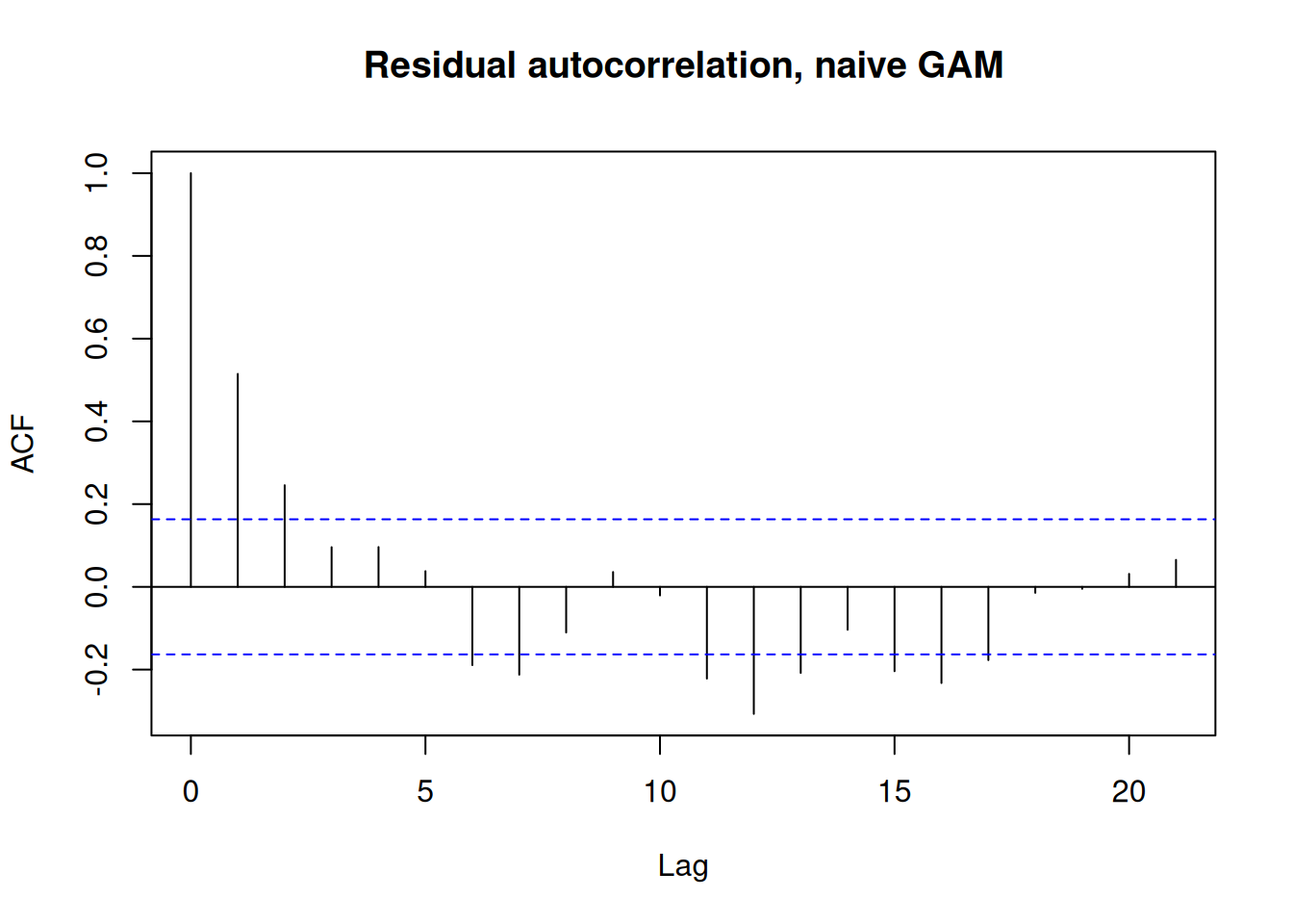
Lag-1 autocorrelation in the residuals is a little over 0.5 — down from the single-term model’s 0.84, but still far from zero. The residual left over after month and year_frac’s smooths are accounted for is still substantially predictable from the previous month’s residual, which an independent-errors model has no way to represent. s(month) absorbed the seasonal cycle it was added for, but it didn’t absorb everything the ACF plot flagged: this is the assumption s(year_frac)’s edf-of-3.85 and its F-test were resting on, and it doesn’t hold here. Practically, that means the naive fit’s standard errors are too small and its F-test overstates how confident the data actually let it be — correlated residuals carry less independent information than the same number of uncorrelated ones would, so treating them as independent understates the uncertainty in both the trend’s shape and its significance.
The concern isn’t hypothetical: a smoothing penalty free to explain slow-moving, positively-autocorrelated noise as if it were curvature will do just that, because from the fitting procedure’s point of view, a real multi-year wiggle and a run of correlated residuals both look like “structure the flat line doesn’t capture.”
With real autocorrelation confirmed, there are two ways to respond: model it explicitly, or fit a separate decomposition (like stl(), used later in this chapter as a visual cross-check) to see the trend and seasonal components apart from the noise. This chapter takes the first path, because only it comes with a corrected significance test — decomposition tools describe a series, they don’t test it.
A generalized additive mixed model keeps the same additive-smooth structure — the same s(year_frac) + s(month), the same basis functions, the same idea of a fitted penalty deciding how much wiggle survives — and adds one thing: an explicit model for the residual autocorrelation just confirmed, rather than assuming it’s zero.
nlme::lme(), of all thingsgamm() reaches for nlme::lme() — ordinarily the workhorse for the grouped, random-intercept kind of mixed model (one intercept per site, per patient, per subject, each drawn as \(b_{0,j} \sim \mathcal{N}(0, \sigma_0^2)\) around a shared population value \(\beta_0\)) — because a spline’s wiggle penalty and a random effect’s variance are the same shrinkage device under the hood: both pull an estimate toward zero by an amount set by an estimated variance, smaller variance meaning more shrinkage. Wood (2017, §5.8) makes that equivalence precise: any penalized spline can be rewritten as a fixed, unpenalized part plus a random-effect part, at which point lme()’s existing variance-component machinery is exactly what’s needed to estimate how much of the smooth’s wiggliness survives.
This chapter uses the other sense of “mixed,” though. Dissolved Oxygen’s 144 monthly readings are one time series, not several sites or subjects each contributing their own intercept, so there’s no group here for a random effect to describe. What this chapter borrows from lme() is the separate correlation argument sitting alongside its random-effects machinery, built for exactly this case: modeling dependence within a single group’s residuals rather than variance across several groups’ intercepts. Both jobs happen to live inside the same nlme::lme() call, but they solve different problems — one is discussed further in Extending this analysis below, where a genuine multi-site version of this model would need both at once.
The specific choice of AR(1), rather than some other correlation structure, comes straight out of the shape of the naive fit’s ACF plot above, not just its lag-1 height: at 0.52, 0.25, and 0.10 for lags 1 through 3, each is roughly half the one before — a geometric decay, which is exactly the signature the \(\phi^{|h|}\) form below produces. That’s a different shape from the oscillating, up-down-up pattern the single-term model’s ACF showed before s(month) was added (the seasonal signal, not autocorrelated noise), and it’s what rules in a simple first-order autoregressive structure specifically, rather than something built around a seasonal lag or a richer autoregressive-moving-average form (corARMA(), covered in Extending this analysis).
mgcv::gamm() fits this correlation piece by handing the smooth-term machinery to nlme::lme() underneath, which accepts a correlation argument — here, corAR1(), an AR(1) structure (first-order autoregressive: each residual depends on the one immediately before it) where the correlation between any two residuals decays geometrically with how far apart in time they are:
\[\mathrm{Corr}(\varepsilon_i, \varepsilon_{i-h}) = \phi^{|h|}, \qquad h = 0, 1, 2, \dots\]
A single parameter \(\phi\) (with \(|\phi| < 1\) for the process to be stationary) sets that whole decay: \(h = 1\) apart (adjacent months) gives correlation \(\phi\) itself, \(h = 2\) apart gives \(\phi^2\), and so on, fading toward zero for observations far apart rather than dropping to zero immediately after one lag. Nothing about the mean structure changes; what changes is that the smooth terms’ significance tests now account for the autocorrelation, which is the point of this chapter.
This case study follows the same template Wood (2017, §7.7.2) uses for nearly a decade of daily Cairo air temperature: a cyclic seasonal smooth plus a smooth long-term trend, fit first as a plain GAM and then refit with gamm() and a corAR1() correlation structure once the residuals showed short-term autocorrelation the seasonal and trend smooths hadn’t absorbed — there, too, the point of adding the AR(1) term was to establish whether a real temperature trend survived once auto-correlated noise was modeled explicitly rather than left for the smooths to soak up.
# same smooth terms as fit_gam above; only the correlation argument is new
# corAR1(form = ~1): lag-1 autocorrelation ordered by row, since do_wq is already one
#            evenly-spaced monthly series with no separate sites/groups to keep apart
fit_gamm <- gamm(log(result) ~ s(year_frac, bs = "tp", k = 10) + s(month, bs = "cc", k = 12),
                  data = do_wq, knots = list(month = c(0.5, 12.5)),
                  correlation = corAR1(form = ~1))
summary(fit_gamm$gam)
Family: gaussian
Link function: identity

Formula:
log(result) ~ s(year_frac, bs = "tp", k = 10) + s(month, bs = "cc",
    k = 12)

Parametric coefficients:
            Estimate Std. Error t value Pr(>|t|)
(Intercept) 2.136947   0.008704   245.5   <2e-16 ***
---
Signif. codes:  0 '***' 0.001 '**' 0.01 '*' 0.05 '.' 0.1 ' ' 1

Approximate significance of smooth terms:
               edf Ref.df     F p-value
s(year_frac) 1.000      1 21.63 8.1e-06 ***
s(month)     7.494     10 72.87 < 2e-16 ***
---
Signif. codes:  0 '***' 0.001 '**' 0.01 '*' 0.05 '.' 0.1 ' ' 1

R-sq.(adj) =  0.916
Scale est. = 0.0030753 n = 144# unconstrained = FALSE: return phi on its natural [-1, 1] scale, not lme's internal optimization scale
phi <- coef(fit_gamm$lme$modelStruct$corStruct, unconstrained = FALSE)
phi Phi
0.5637352 # same model, correlation argument dropped, as the no-AR(1) comparison for the AIC check below
fit_gamm0 <- gamm(log(result) ~ s(year_frac, bs = "tp", k = 10) + s(month, bs = "cc", k = 12),
data = do_wq, knots = list(month = c(0.5, 12.5)))
AIC(fit_gamm0$lme, fit_gamm$lme) df AIC
fit_gamm0$lme 5 -394.6952
fit_gamm$lme 6 -445.2578Three results, together:
s(year_frac)’s edf drops back to 1.00: a straight line.The wiggle the naive fit found on the trend term evaporates once the residual correlation is given somewhere else to go. The smooth term is still significant (\(p = 8.1\times10^{-6}\)) — there’s a real long-term decline here — but it’s a simple, constant-rate decline, much simpler than the trajectory the naive GAM implied.
# type = "terms", terms = "s(year_frac)": returns only that smooth's contribution, so the
# month column's value below doesn't matter — it's a placeholder to satisfy predict(), not an input to this term
year_grid <- data.frame(year_frac = range(do_wq$year_frac), month = c(1, 1))
pred <- predict(fit_gamm$gam, newdata = year_grid, type = "terms", terms = "s(year_frac)")
slope_per_year <- diff(pred[, 1]) / diff(year_grid$year_frac)
slope_per_year
2
-0.01150398 (exp(slope_per_year) - 1) * 100 2
-1.143806 The corrected rate is about -1.14% per year.
Before isolating the trend on its own, it’s worth checking the full fitted curve — trend and season together — against the raw points it was fit to:
do_wq <- do_wq |> mutate(fitted = exp(predict(fit_gamm$gam, type = "response")))

ggplot(do_wq, aes(year_frac)) +
  geom_point(aes(y = result), alpha = 0.4) +
  geom_line(aes(y = fitted), color = "steelblue", linewidth = 1) +
  labs(title = "Dissolved Oxygen — AR(1)-corrected GAMM fit vs. raw record",
       y = "DO (mg/L)", x = "Year") +
  nlt_theme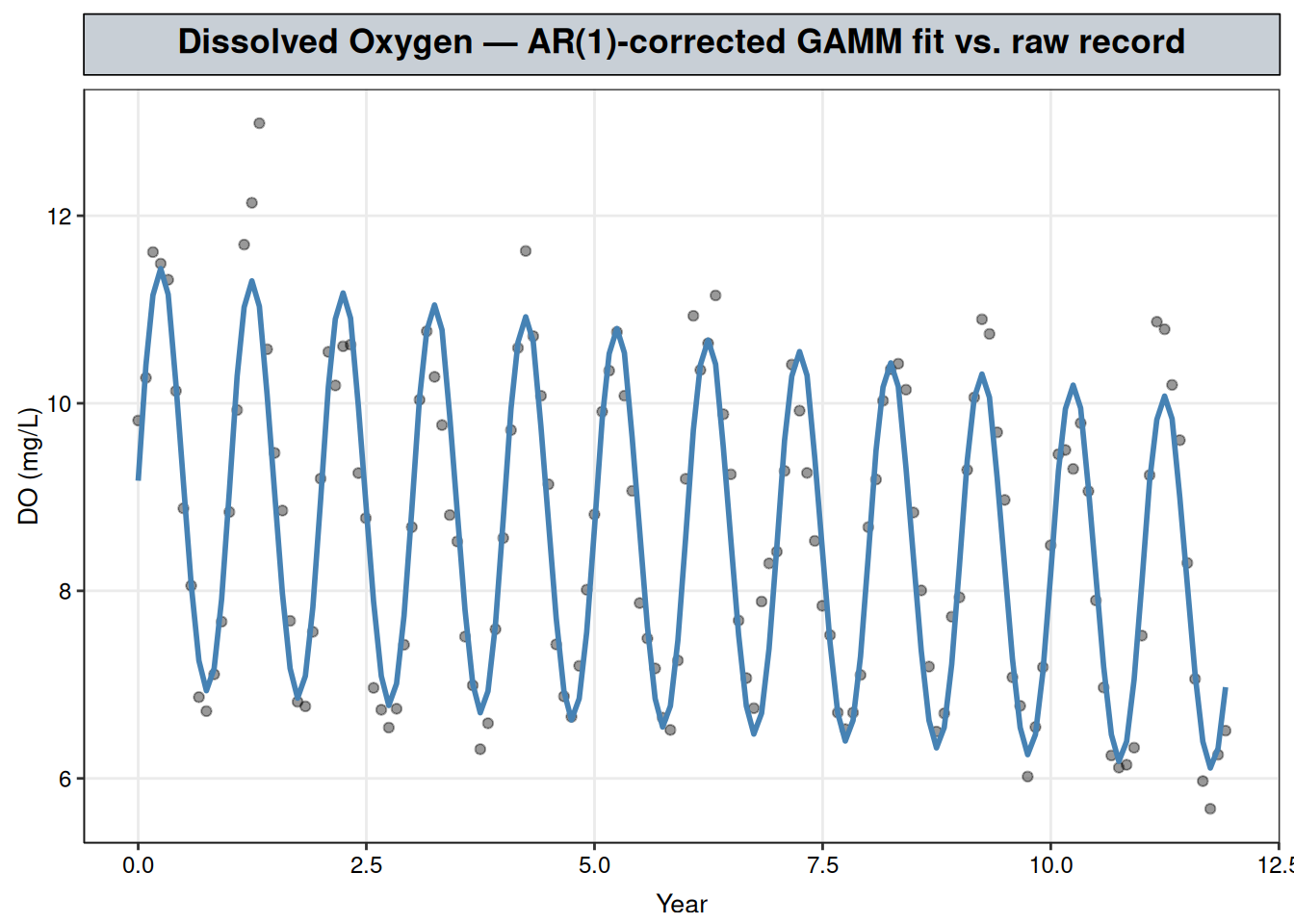
The fitted curve tracks the seasonal saw-tooth closely — that’s s(month) doing its job — while riding a slight downward drift across the record, s(year_frac)’s contribution. This is the mean structure only: predict() returns the fixed smooth terms, not a one-step-ahead forecast that would additionally borrow information from a neighboring observation’s residual through the fitted AR(1) correlation. That’s the right comparison for this chapter’s purpose (does the mean function the significance test is built on describe the data), as distinct from a forecasting fit, which is out of scope per this site’s premise.
A single slope-per-year number is a summary; seeing the trend itself is a better check on it. predict(..., type = "terms") isolates s(year_frac)’s contribution on its own, separate from s(month), which is the “trend component” a classical decomposition (e.g. STL) would plot — recovered here as a term of the fitted GAMM rather than by a separate decomposition step.
# 200-point grid spanning the record, for a smooth trend curve
# month: placeholder value, as in the rate chunk above — type = "terms" ignores it
trend_grid <- data.frame(
  year_frac = seq(min(do_wq$year_frac), max(do_wq$year_frac), length.out = 200),
  month = 6
)
trend_term <- predict(fit_gamm$gam, newdata = trend_grid, type = "terms",
                       terms = "s(year_frac)", se.fit = TRUE)
# GAM smooth terms are centered at zero by construction, so the intercept is added
# back in to plot the trend on the response's actual scale rather than as a deviation from it
intercept <- coef(fit_gamm$gam)[["(Intercept)"]]
trend_grid <- trend_grid |>
  mutate(
    fit   = intercept + trend_term$fit[, "s(year_frac)"],
    lower = fit - 1.96 * trend_term$se.fit[, "s(year_frac)"],
    upper = fit + 1.96 * trend_term$se.fit[, "s(year_frac)"]
  )

ggplot(trend_grid, aes(year_frac, exp(fit))) +
  geom_ribbon(aes(ymin = exp(lower), ymax = exp(upper)), alpha = 0.2) +
  geom_line(linewidth = 1) +
  labs(title = "Dissolved Oxygen — trend component, seasonality removed",
       subtitle = "s(year_frac) term from the AR(1)-corrected GAMM, 95% CI",
       y = "DO (mg/L)", x = "Year") +
  nlt_theme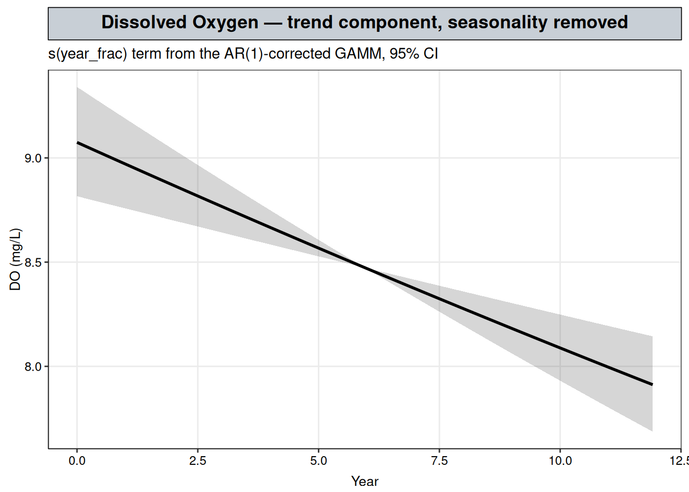
The band widens gradually toward both ends of the record, as fitted-curve uncertainty usually does away from the bulk of the data, but never crosses back to flat or rising — consistent with the significant, monotonic decline reported above, and a visual check on the edf = 1.00 finding: the line drawn here is genuinely straight, the curvature penalized out entirely rather than merely averaging out to a negative slope.
stl()R’s equivalent to statsmodels’ STL is stats::stl() (base stats::decompose() is the older, less flexible version), which splits a regularly-spaced ts object into trend, seasonal, and remainder components using Loess rather than a penalized regression spline. It’s worth a quick look here as a sanity check, but it isn’t a substitute for the GAMM fit above:
stl() returns a trend curve with no standard error and no significance test attached, so it can’t answer this chapter’s actual question — whether the decline is distinguishable from noise.ts object — one evenly-spaced value per period, no gaps. That’s a real constraint for water-quality monitoring records, which often have missed samples or irregular visit intervals.do_wq happens to be a complete, evenly-spaced monthly series (144 rows, 12 per year, no gaps), so stl() applies cleanly here without any imputation. A record with missing months would need to be filled in first, or handled with a regression-based smooth like s(year_frac) instead, which tolerates gaps natively since it fits against the actual sampling dates rather than a fixed-frequency grid.
do_ts <- ts(log(do_wq$result), start = c(min(do_wq$year), 1), frequency = 12)
do_stl <- stl(do_ts, s.window = "periodic")
plot(do_stl, main = "STL decomposition, log(DO) — cross-check only")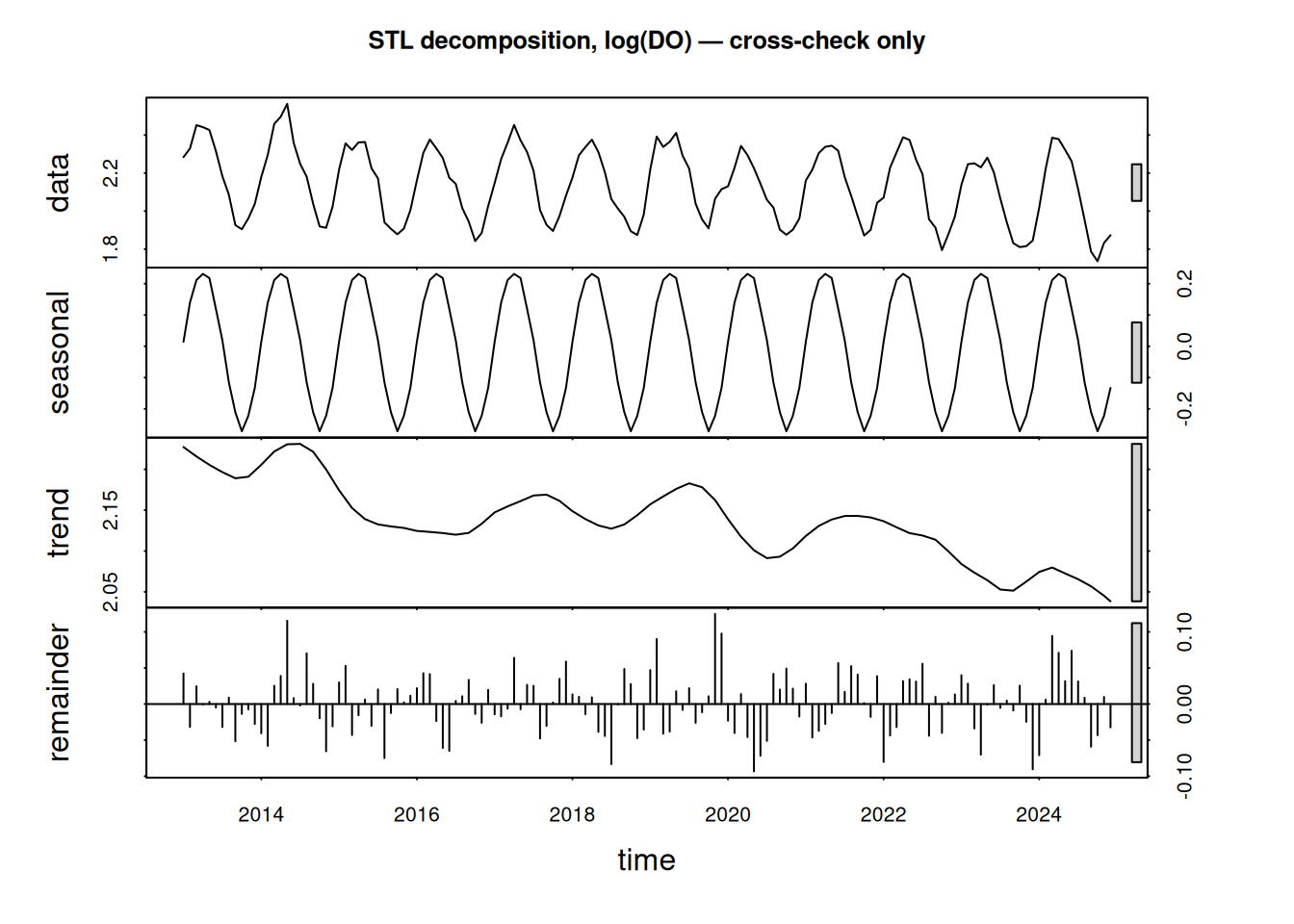
The STL trend-cycle component traces the same steady decline s(year_frac) recovers above — reassuring, but it comes with no p-value. stl() can show that a decline exists; it can’t say whether it’s distinguishable from the correlated noise the ACF check flagged earlier in this chapter. Closing that gap is what the GAMM’s F-test is for.
It’s also worth noticing that STL’s trend-cycle line above wanders, unlike the GAMM’s straight edf = 1.00 trend — the same kind of local wiggle the naive GAM’s uncorrected fit found. That difference comes from what each method is built to do. stl()’s Loess window has no significance test to fail and no correlation structure to hand noise off to, so any short-run wiggle in the data, real or not, shows up in its trend-cycle line by construction. The GAMM’s smoothing penalty, once the AR(1) term is given that same noise to explain, has somewhere else to put it instead — which is why the wiggle a purely descriptive tool always shows evaporates once a model tests whether it’s distinguishable from noise.
# resid(..., type = "normalized"): Pearson residuals divided through by the fitted AR(1)
# structure, so they should look like independent noise if the correction worked
resid_norm <- as.numeric(resid(fit_gamm$lme, type = "normalized"))
shapiro.test(resid_norm)
    Shapiro-Wilk normality test

data:  resid_norm
W = 0.99221, p-value = 0.6189bptest(lm(resid_norm ~ fitted(fit_gamm$gam)))
    studentized Breusch-Pagan test

data:  lm(resid_norm ~ fitted(fit_gamm$gam))
BP = 0.8266, df = 1, p-value = 0.3633
Both tests fail to reject their null on the normalized residuals: Shapiro-Wilk (\(p = 0.619\)) finds no evidence of non-normality, and Breusch-Pagan (\(p = 0.363\)) finds no evidence of heteroscedasticity.
acf(resid_norm, main = "Residual autocorrelation, AR(1)-corrected")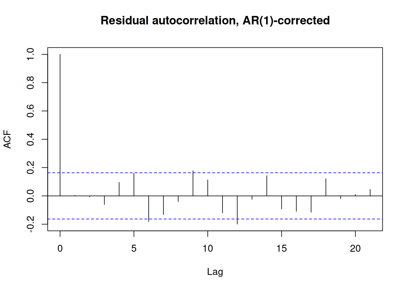
The lag-1 autocorrelation that was above 0.5 in the naive fit is now close to zero: the correction did what it was supposed to.
The general lesson carries beyond this one series: fitting a GAM to a regularly sampled monitoring record and reading its smooth-term significance at face value skips a step — checking acf(resid(fit)) first, and reaching for gamm() with a correlation structure when it shows real autocorrelation, the way it did here.
Stepping back, this is what getting the model’s structure right buys: log(DO) has three things riding on top of each other in the raw series — a long-term trend, an annual seasonal cycle, and correlated residual noise — and the GAMM is what separates them, rather than leaving them tangled together the way the raw plot at the top of this chapter does. Separating them, rather than eyeballing the record or decomposing it descriptively, is what turns a shape into a defensible claim.
corAR1() was the right correction here because the ACF plot showed a single lag-1 dependency decaying geometrically. A residual ACF with a different shape on another record — a spike at the seasonal lag instead of lag 1, or a decay corAR1()’s single parameter can’t fit — would call for nlme::lme()’s richer corARMA() family instead.
This also remains a single-site model. Extending it to a monitoring network of several sites is where the other sense of “mixed” flagged above would apply: a random intercept per site, layered on top of the same trend and seasonal smooths, with the AR(1) correlation — if it held at every site — sitting alongside it in the same lme() call rather than replacing it.
That pooled model is a heavier build: one more variance component, a correlation structure that has to be justified at every site rather than one, and a shared seasonal shape that may not hold everywhere. It earns its keep when individual sites have too short a record to estimate their own trend confidently and need to borrow strength from the rest of the network, or when the deliverable is a basin-wide statement rather than a single-site one. Otherwise, fitting this chapter’s single-site GAMM once per site keeps each site’s significance test about that site alone, and is simpler to build and explain to a client asking about their one location.