k-Nearest Neighbors Regression
Total Phosphorus — a rise that levels into a plateau
1 Predicting by averaging nearby points
k-nearest-neighbors is most often introduced as a classifier: to label a query point, find its \(k\) closest training points and take a majority vote of their classes. The regression version keeps the same lookup — find the \(k\) closest points — and replaces the vote with an average of their (continuous) response values. Nothing else about the method changes; “regression” here just means the thing being predicted is a number, not a category.
It’s commonly filed under machine learning rather than classical statistics, specifically as a supervised (it learns from labeled training examples), non-parametric (no fixed functional form), instance-based method — nothing is estimated ahead of time, so all the “learning” happens at prediction time by looking up nearby stored examples.
Total Phosphorus rises through the middle years of the record and then settles onto a plateau. That shape doesn’t match the case studies covered so far: piecewise regression assumes a single slope break, changepoint detection assumes a single level shift, and neither describes a smooth rise into a plateau. There’s also no single point an analyst could point to as “the” knot.
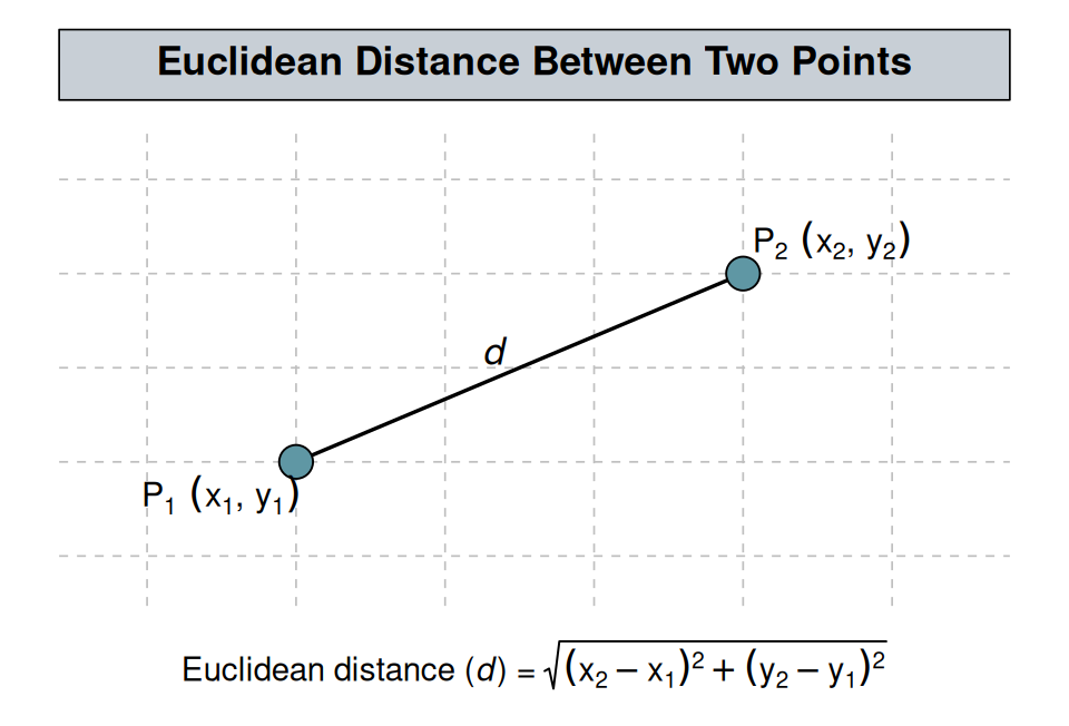
k-nearest-neighbors (k-NN) regression handles this by not committing to any functional form at all. “Nearest” is defined by Euclidean distance — the straight-line distance between two points, familiar from the Pythagorean theorem:
A query point \(x_0\) is just wherever a prediction is wanted — it’s chosen by whoever’s asking, rather than estimated by the algorithm. That’s worth being explicit about because k-NN is easy to conflate with k-means clustering: k-means invents \(k\) centroids by starting them at random and iteratively updating their positions. k-NN has no centroids and nothing random — for a query point \(x_0\) on year_frac, it finds the \(k\) training observations closest to it by this distance (here, on year_frac alone) — call this neighborhood \(N_k(x_0)\) — and predicts the plain average of their responses. The fitted curve below is built from many query points along a plotting grid, each one an independent lookup-and-average:
\[\hat y(x_0) = \frac{1}{k} \sum_{i \in N_k(x_0)} y_i.\]
This is a lookup-and-average rule applied at prediction time, and it breaks from every method in this site so far in one specific way: those methods all still fit a linear predictor underneath, even when the shape looks nonlinear.
Piecewise regression’s hinge term, for instance, is just an extra column handed to lm() — see The Regression Framework for why that still counts as “linear.” k-NN has no linear predictor at all: no coefficients are estimated, just this neighborhood average, recomputed fresh at each query point.
2 A diagnostic pass, not an endpoint
That makes this chapter, and LOESS after it, a diagnostic pass rather than an endpoint — the goal is to see the record’s shape clearly enough to decide what to do with it next, not to settle for a curve with no coefficient or p-value attached to it.
Nonparametric is the word for that: no functional form is assigned up front, so the fit is genuinely useful for prediction — reading off a plausible value at any point in the record — but supports no inference at all, since there’s no coefficient to attach a standard error or a p-value to.
That diagnostic pass then forks in one of two directions once the shape is clear: - If it resolves into a recognizable family, it can be handed off to a parametric curve directly and the inferential machinery recovered in one step; that’s the move Post-Diagnosis: Committing to a Parametric Form makes, fitting Total Phosphorus’s rise-and-plateau as a logistic growth curve and comparing it back against the k-NN and LOESS fits that found the shape in the first place. - If it doesn’t resolve into anything recognizable — Total Copper’s step-and-spike pattern, covered in GAM, is the case where it doesn’t — the flexibility has to stay in the model itself instead of being handed off to a fixed curve.
Concentration data is modeled on the log scale throughout this site for the reasons covered in Transformations — a multiplicative process where variability scales with the mean — and Total Phosphorus is no exception; log(result) is used below.
3 The shape in the record
ggplot(tp_wq, aes(year_frac, result)) +
  geom_point(alpha = 0.5) +
  geom_smooth(se = FALSE) +
  labs(title = "Total Phosphorus — raw scale", y = "Phosphorus (mg/L)") +
  nlt_theme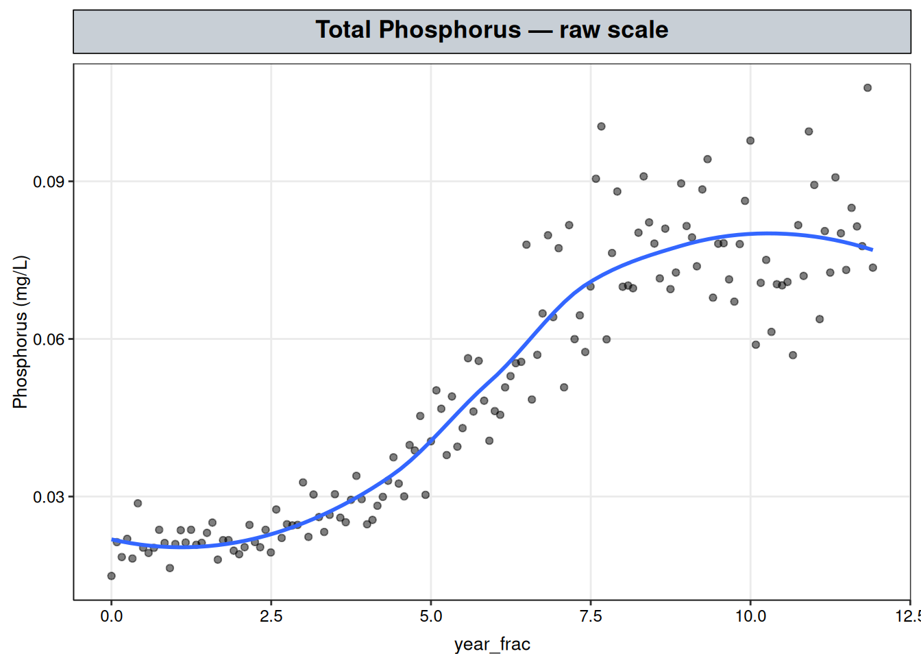
An early low, roughly flat stretch, a rise through the middle years, and a plateau at a higher level for the remainder of the record — the shape a logistic curve would produce, though nothing here assumes that form.
4 Choosing k: the bias-variance tradeoff
\(k\) is the one tuning parameter this method has, and it controls a direct bias-variance tradeoff: - A small \(k\) averages over only a handful of nearby points, so the fitted curve tracks the training data’s noise as much as its signal — low bias, high variance. - A large \(k\) averages over a wide neighborhood, smoothing away real curvature along with the noise — low variance, high bias.
There’s no fitted coefficient to inspect here, so the tradeoff has to be shown, not asserted:
# 300 evenly spaced query points spanning the record — not real observations,
# just x-values to predict at so the fitted curve can be drawn continuously.
grid <- data.frame(year_frac = seq(min(tp_wq$year_frac), max(tp_wq$year_frac), length.out = 300))

sweep_ks <- c(3, 20, 60)
# Refit knnreg() once per candidate k, predict log(result) at every grid point,
# undo the log with exp(), and tag each set of predictions with its k.
sweep_fits <- lapply(sweep_ks, function(k) {
  m <- knnreg(log(result) ~ year_frac, data = tp_wq, k = k)
  grid |> mutate(fit = exp(predict(m, newdata = grid)), k = factor(k))
})
# Stack the three per-k prediction sets into one long data frame for plotting.
sweep_df <- bind_rows(sweep_fits)

ggplot() +
  geom_point(data = tp_wq, aes(year_frac, result), alpha = 0.35, color = "grey40") +
  geom_line(data = sweep_df, aes(year_frac, fit, color = k), linewidth = 1) +
  labs(title = "Total Phosphorus — k-NN fit at three values of k", y = "Phosphorus (mg/L)", color = "k") +
  nlt_theme +
  theme(legend.position = "right")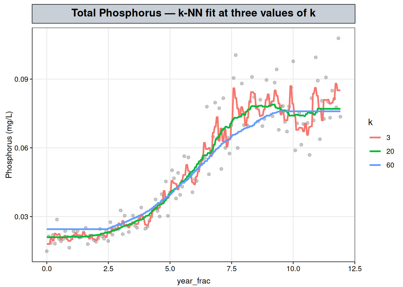
At \(k = 3\) the curve is jagged, chasing individual points rather than the underlying rise; at \(k = 60\) it’s smoothed almost flat, blunting the plateau’s onset; \(k = 20\) sits between the two, tracking the rise without visibly reacting to single points.
Rather than pick a value by eye, \(k\) is chosen by 10-fold cross-validation, minimizing mean squared error on the log scale across held-out folds. caret is R’s general-purpose package for exactly this kind of workflow — resampling, hyperparameter tuning, and model comparison across dozens of underlying model types through one consistent train() interface. caret::train() handles the fold-splitting, refit-per-candidate, and averaging that a hand-written loop would otherwise need; search = "random" has it sample tuneLength candidate values of \(k\) at random rather than sweeping a fixed grid:
# Fix the RNG so both the fold assignment and the random k's sampled below
# are reproducible across renders.
set.seed(1)
# 10-fold CV, with candidate hyperparameter values drawn at random rather
# than swept exhaustively.
ctrl <- trainControl(method = "cv", number = 10, search = "random")
# tuneLength = 8 draws 8 random candidate k's to cross-validate, instead of
# an exhaustive grid over every k from 1 to n. train() does the fold
# splitting, per-candidate refitting, and error averaging internally
cv_fit <- train(
  log(result) ~ year_frac, data = tp_wq,
  method = "knn",
  tuneLength = 8,
  trControl = ctrl
)

# caret package reports fit quality as root mean squared error (RMSE)
# on the log scale; squaring it back to
# MSE keeps this table on the same footing as the rest of the chapter.
cv_fit$results |>
  transmute(k, cv_mse = round(RMSE^2, 4)) |>
  arrange(k)
k cv_mse
1 1 0.0361
2 14 0.0188
3 18 0.0188
4 23 0.0189
5 33 0.0193
6 34 0.0193
7 39 0.0201
8 43 0.0207# The k with the lowest cross-validated RMSE, chosen automatically by train().
best_k <- cv_fit$bestTune$k
# Refit with knnreg() (rather than reusing cv_fit) so the final model matches
# the plain k-NN fit used everywhere else in this chapter.
fit_tp <- knnreg(log(result) ~ year_frac, data = tp_wq, k = best_k)
best_k[1] 14Cross-validated error is minimized at \(k =\) 14: small enough to track the rise-and-plateau shape, large enough that no single observation swings the prediction. Though, given that the synthetic data is derived from a log function, there may be overfitting on the data given the meandering plateau of the curve.
5 The fitted curve
grid <- grid |> mutate(fit = exp(predict(fit_tp, newdata = grid)))

ggplot() +
  geom_point(data = tp_wq, aes(year_frac, result), alpha = 0.4, color = "grey40") +
  geom_line(data = grid, aes(year_frac, fit), color = "steelblue", linewidth = 1) +
  labs(title = sprintf("Total Phosphorus — k-NN fit (k = %d)", best_k), y = "Phosphorus (mg/L)") +
  nlt_theme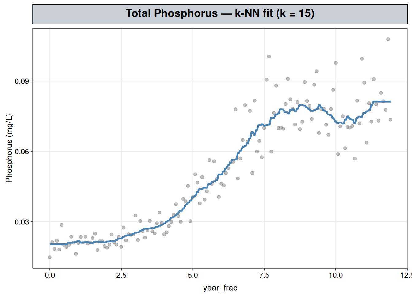
No confidence band is shown here, because none is available: knnreg() produces a fitted value at each point, without a coefficient or a standard error behind it. That rules out a significance test, a slope estimate, or a p-value. This fit is best read as a prediction-oriented baseline: the cross-validated MSE above (0.0188 on the log scale) is the one number the method offers, and it measures how well the rule predicts points in the test set, not whether the apparent trend is statistically real. That number has no meaningful scale on its own — it’s the smallest value in the CV table above, i.e. the error at the best-performing \(k\) among the candidates tried. Its use is comparative within this chapter: it’s what picked best_k over the other candidates, not a figure to be judged in isolation or against another method’s fit.
6 Interpretation
k-NN recovers the rise-and-plateau shape using only a neighborhood-averaging rule tuned by cross-validation, without being told any functional form. That’s a diagnosis, not a conclusion: no coefficient says how fast Phosphorus rose, no interval bounds where the plateau sits, and no test distinguishes a real leveling-off from a stretch where the data happens to thin out.
The next chapter fits LOESS to the same data with a different local-averaging mechanic — a weighted local regression in place of a flat neighborhood average.
The two methods aren’t independent in a strong sense, since both are smoothing the same observations; where their curves agree, what that mainly rules out is the shape being an artifact of k-NN’s particular averaging rule rather than a real feature of the record. That’s necessary but not sufficient to commit to a parametric curve: the further judgment call — whether the corroborated shape actually resembles a recognizable family like logistic growth, rather than resolving into nothing identifiable — is made separately in Post-Diagnosis: Committing to a Parametric Form, two chapters ahead.
7 Extending this analysis
k-NN’s neighborhood average treats every observation in \(N_k(x_0)\) equally, whether it sits right at \(x_0\) or out at the edge of the window — a point one month away counts exactly as much as a point three years away, as long as both are among the \(k\) nearest. A natural refinement is to weight observations by distance instead of averaging them flatly: points closer to \(x_0\) count for more, points near the edge of the neighborhood count for less. That’s the exact extension LOESS, next, makes — the same idea of borrowing strength from nearby points, but weighted by distance and fit as a small regression rather than averaged flatly.
That refinement isn’t free, though — k-NN keeps a few things LOESS gives up in exchange for the smoother, distance-weighted fit:
- Fewer moving parts. One tuning parameter (
k) versus LOESS’s two (spananddegree). - Cheaper to compute. A neighborhood average versus a weighted least-squares fit solved fresh at every query point.
- Bounded predictions. Because \(\hat y(x_0)\) is simply an average of observed responses in \(N_k(x_0)\), it can never fall outside the range of those neighbors. LOESS’s local line (or parabola) can overshoot past that range, particularly near the edges of the record where the neighbourhood is one-sided.