ggplot(tp_wq, aes(year_frac, result)) +
  geom_point(alpha = 0.5) +
  geom_smooth(se = FALSE) +
  labs(title = "Total Phosphorus — raw scale", y = "Phosphorus (mg/L)") +
  nlt_theme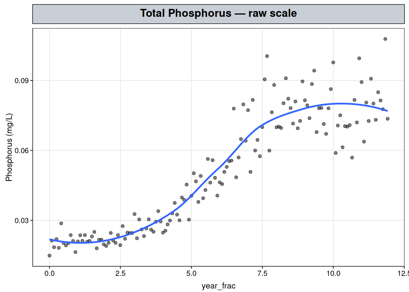
Total Phosphorus — the same rise-then-plateau, a smoother local fit
This is the same Total Phosphorus record used for k-Nearest Neighbors Regression — a rise through the middle years that settles onto a plateau — fit here with LOESS instead, for a direct comparison of two local methods on identical data. Where k-NN predicts each point as the flat average of its \(k\) nearest neighbors, LOESS fits a separate weighted regression at every query point \(x_0\):
\[\hat\beta(x_0) = \arg\min_\beta \sum_{i=1}^n w_i(x_0)\left(y_i - x_i^\top \beta\right)^2, \qquad w_i(x_0) = \left(1 - \left|\frac{x_i - x_0}{h}\right|^3\right)^3_+,\]
using only the nearby observations — the weight \(w_i(x_0)\) is largest for points right at \(x_0\), decays smoothly to zero at the edge of the neighborhood, and is exactly zero beyond it, where \(h\) is the neighborhood radius.
span is the parameter that sets \(h\): it’s the proportion of the total data included in each local neighborhood, so span = 0.5 means every local fit uses the nearest 50% of points to \(x_0\), and larger span values mean wider, smoother neighborhoods.
stats::loess() is base R — no additional package is required. The response is modeled on the log scale, for the same reasons covered in Transformations.
degree sets the order of each local fit, distinct from the shape of the whole curve.
degree = 0 is a local weighted average — closer in spirit to k-NN’s flat average than to a regression at all;degree = 1 fits a local straight line at every point;degree = 2 fits a local parabola.LOESS fits a different local line at every target point, so degree = 1 still produces a curve that bends over the full record, made up of many local linear pieces stitched together. In contrast to lm(y ~ x), which fits one slope for the entire dataset, loess(y ~ x, degree = 1) fits many local slopes, each valid only in its own neighborhood.
geom_smooth()’s default curve below is already a LOESS fit: for fewer than 1,000 points, ggplot2 calls stats::loess() under the hood with span = 0.75 and degree = 2, on the raw (untransformed) scale. That’s a wider neighborhood and a higher local order than the fit selected below, so it’s a reasonable first look at the shape but not the fit this chapter commits to.
ggplot(tp_wq, aes(year_frac, result)) +
geom_point(alpha = 0.5) +
geom_smooth(se = FALSE) +
labs(title = "Total Phosphorus — raw scale", y = "Phosphorus (mg/L)") +
nlt_theme
Same shape as in the k-NN chapter: a low, roughly flat start, a rise through the middle years, and a plateau at a higher level for the rest of the record.
# Fine grid for plotting fitted curves later, not for this comparison
grid <- data.frame(year_frac = seq(min(tp_wq$year_frac), max(tp_wq$year_frac), length.out = 300))

# All span/degree combinations to compare; in-sample residual SD only, so it
# will favor narrower spans and higher degrees by construction (see prose below)
span_degree_grid <- expand.grid(span = c(0.3, 0.5, 0.75), degree = c(1, 2))
resid_sd <- mapply(function(sp, deg) {
  m <- loess(log(result) ~ year_frac, data = tp_wq, span = sp, degree = deg)
  sd(resid(m))
}, span_degree_grid$span, span_degree_grid$degree)

data.frame(span_degree_grid, resid_sd = round(resid_sd, 4))
span degree resid_sd
1 0.30 1 0.1352
2 0.50 1 0.1413
3 0.75 1 0.1596
4 0.30 2 0.1315
5 0.50 2 0.1359
6 0.75 2 0.1400Residual spread rises as span widens and drops as degree increases within a fixed span — both expected, since a narrower neighborhood and a higher local order each add flexibility. But the residual SD alone doesn’t show why the lowest-SD combination isn’t the right choice — for that, the fitted curves themselves need to be seen side by side:
fit_curves <- do.call(rbind, Map(function(sp, deg) {
  m <- loess(log(result) ~ year_frac, data = tp_wq, span = sp, degree = deg)
  pred <- predict(m, newdata = grid, se = TRUE)
  # 95% CI built on the log scale, then exponentiated, so the band is
  # correctly asymmetric on the mg/L scale rather than symmetric around fit
  data.frame(
    year_frac = grid$year_frac,
    fit = exp(pred$fit),
    lower = exp(pred$fit - 1.96 * pred$se.fit),
    upper = exp(pred$fit + 1.96 * pred$se.fit),
    span = sp, degree = deg
  )
}, span_degree_grid$span, span_degree_grid$degree))

ggplot() +
  geom_point(data = tp_wq, aes(year_frac, result), alpha = 0.3, color = "grey40", size = 0.8) +
  geom_ribbon(data = fit_curves, aes(year_frac, ymin = lower, ymax = upper), fill = "steelblue", alpha = 0.2) +
  geom_line(data = fit_curves, aes(year_frac, fit), color = "steelblue", linewidth = 0.8) +
  facet_grid(degree ~ span, labeller = label_both) +
  labs(title = "Total Phosphorus — LOESS fits across span and degree", y = "Phosphorus (mg/L)") +
  nlt_theme +
  theme(panel.spacing.x = unit(1, "lines"))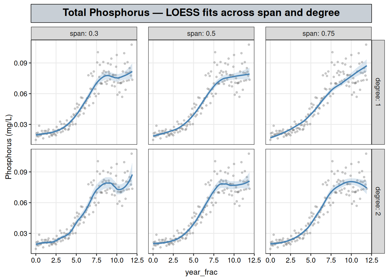
These aren’t just noisier or smoother versions of the same curve — three of the six panels tell visibly different stories about what happens late in the record.
span = 0.5, degree = 1 settles onto a flat plateau with no late structure.span = 0.3, degree = 2 — the combination with the lowest residual SD in the table above — instead shows the plateau dip and rise again near the end, a meandering shape rather than a flat one; that’s the same kind of feature the k-NN chapter’s own cross-validated fit picked up in its plateau, so it isn’t unique to this method’s noise.span = 0.75, degree = 2 — geom_smooth()’s own default combination — bends downward at the very end of the record, which read on its own would look like the start of a decline.Only one of those three readings can be right, and the disagreement is concentrated exactly where local regression is least trustworthy: at the boundary of the record, a local fit only has neighbors on one side, so its variance is highest there regardless of span or degree. The 95% confidence bands make this visible directly — they’re narrow through the rise and the middle of the plateau in every panel, then widen noticeably at the right-hand edge, most visibly in span = 0.3, degree = 2, exactly where that panel’s dip-and-rise appears. A dip, a rise, or a downward tilt confined to the last few points, sitting inside a band that wide, is the kind of artifact boundary variance produces, so none of the three should be read as a discovery about the last years of the record.
span = 0.5, degree = 1 is used below because a flat reading close to the boundary is the more conservative call, given that the alternative shapes only show up as boundary noise rather than a feature the middle of the record also displays.
Those bands exist at all because each point on the curve comes from a genuine weighted regression — an intercept and, at degree = 1 or 2, a local slope, estimated by weighted least squares — not a plain average. Any least-squares fit carries a standard error on its coefficients, so predict(..., se = TRUE) can propagate that into a standard error on the fitted value at each point, the same way it would for an ordinary lm() fit.
k-NN has no equivalent: it only ever computes an average of the \(k\) nearest values, with no coefficients and nothing to attach a standard error to, so knnreg() returns a prediction with no attached uncertainty. Nothing in the earlier comparison plot flagged its own boundary as less trustworthy the way the bands above do for LOESS. That doesn’t make k-NN’s boundary behavior more reliable, though — it’s just quieter about the problem.
# span/degree chosen above; fit on the log scale, then predict and
# exponentiate back to mg/L for the comparison plot below
fit_tp_loess <- loess(log(result) ~ year_frac, data = tp_wq, span = 0.5, degree = 1)
grid <- grid |> mutate(fit = exp(predict(fit_tp_loess, newdata = grid)))# k = 14, the cross-validated best_k from the k-NN chapter, refit here so
# this comparison uses the same fitted model rather than an arbitrary k
knn_fit <- caret::knnreg(log(result) ~ year_frac, data = tp_wq, k = 14)
grid <- grid |> mutate(knn_fit = exp(predict(knn_fit, newdata = grid)))
# Long format so LOESS and k-NN can share one color aesthetic in the plot
compare_df <- grid |>
select(year_frac, LOESS = fit, `k-NN` = knn_fit) |>
tidyr::pivot_longer(c(LOESS, `k-NN`), names_to = "method", values_to = "fit")
ggplot() +
geom_point(data = tp_wq, aes(year_frac, result), alpha = 0.3, color = "grey40") +
geom_line(data = compare_df, aes(year_frac, fit, color = method), linewidth = 1) +
labs(title = "Total Phosphorus — LOESS vs. k-NN", y = "Phosphorus (mg/L)", color = NULL) +
nlt_theme +
theme(legend.position = "right")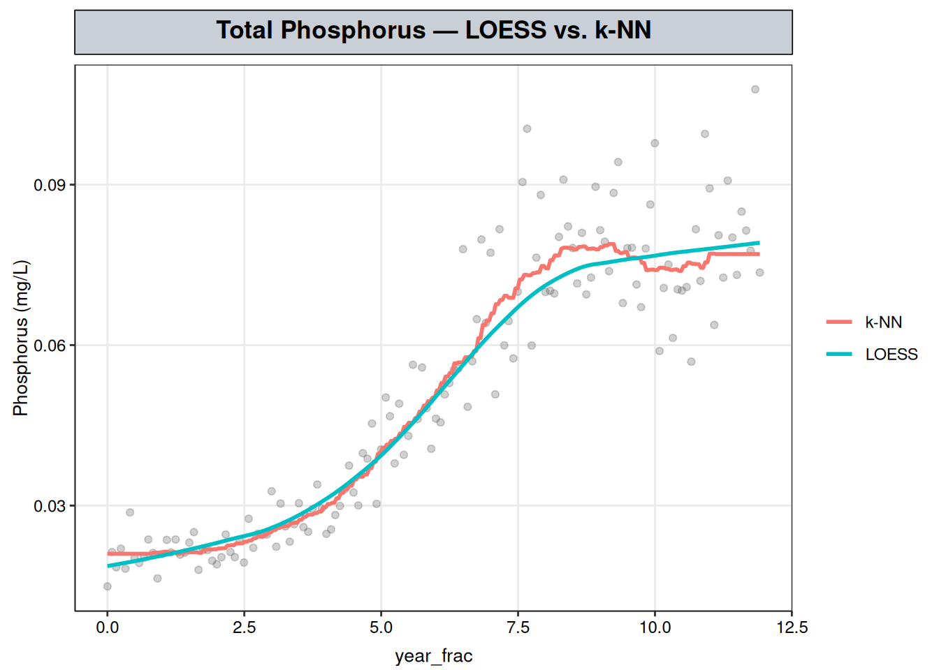
The two curves track the same rise-and-plateau shape closely, but LOESS’s is visibly smoother through the transition — a consequence of fitting a local line rather than a flat local average, so the curve doesn’t have to jump between step-like neighborhood means as the window slides along the record.
A standard error is how much an estimate would be expected to vary if the data were resampled and the fit redone — it’s what a confidence interval is built from, and what a significance test checks an estimate against.
The confidence bands two sections above show that a pointwise standard error exists here: each local fit has its own, which is what widened at the record’s boundary. A single standard error for the whole record does not exist.
There’s no one global coefficient — no single number for “the trend” — so there’s nothing for a global standard error or significance test to attach to. loess() doesn’t return an object structured to support one the way lm() or mgcv::gam() do, and that’s a structural consequence of the method.
LOESS is a genuinely useful tool for prediction, at the cost of the inferential interpretability a parametric or semi-parametric model provides. Its role in this progression is to establish the shape clearly enough that, if a recognizable family fits, the next chapter can commit to it and recover that inferential machinery directly.
LOESS reproduces the same rise-then-plateau shape as k-NN, more smoothly. The two methods aren’t independent checks in a strong sense — both are local averages of the same observations. Their agreement supports a real feature of the data rather than an artifact of the averaging method.
Neither fit supports a significance test on its own. But the shape they agree on looks like a logistic growth curve, a recognizable parametric family. Recognizing that is a judgment call rather than something either fit tests directly, and it’s enough to justify committing to that form. Post-Diagnosis: Committing to a Parametric Form, next, fits the logistic curve directly and recovers three interpretable numbers — a plateau level, an inflection point, and a transition speed — that neither LOESS nor k-NN could offer.