Total Phosphorus — fitting the logistic curve that k-NN and LOESS both pointed toward
1 Committing to the logistic form
k-NN and LOESS agree on the same shape for Total Phosphorus: a rise through the middle years settling onto a plateau.
Neither, though, can attach a significance test to that shape — LOESS’s confidence bands are pointwise rather than a single standard error for the record as a whole, and widen at the boundary rather than support any global claim; k-NN has no standard error at all (see why LOESS doesn’t support a significance test). That agreement, plus the absence of any inferential machinery from either fit, is what justifies moving past a purely local read and asking whether a specific parametric family describes this shape instead.
What counts as a good enough fit here follows from the goal, not from clearing every assumption a more demanding claim would need. The goal in this chapter is modest and specific: a small number of interpretable, reportable quantities, recovered from the simplest curve that plausibly produces a rise-then-plateau. That’s a more modest bar than a fully calibrated confidence interval on each one, a distinction discussed further below.
1.1 Why the logistic form
In fact, a rise-then-plateau is what a logistic growth curve produces:
where \(\mathrm{Asym}\) is the plateau level, \(\mathrm{xmid}\) is the inflection point (the year at which the rise is steepest), and \(\mathrm{scal}\) sets how fast the curve transitions between its floor and its plateau.
Unlike k-NN or LOESS, this is a genuine parametric commitment: it assumes the record really does follow this specific shape, in exchange for three interpretable, testable parameters instead of a lookup-and-average or a locally weighted line. That’s a different kind of number than span, degree, or k-NN’s k: those are tuning knobs the analyst sets before fitting, chosen for how well the resulting curve behaves, not because they mean anything about the underlying data. Asym, xmid, and scal are the opposite — unknowns estimated from the data, each with a physical reading that can be reported on its own.
1.2 Not to be confused with other sigmoid models
The same S-shaped equation shows up under several different names elsewhere in statistics. The curve itself is identical in every case below; what separates them is two questions: what plays the role of the x-axis, and whether the sigmoid functions as the model itself or is being used to reshape something else into a valid range.
Logistic growth curve (this chapter): x-axis is time (year_frac). The sigmoid is the model itself, describing how phosphorus concentration rises and plateaus. The response is continuous, and the fit is by least squares (nls).
Logistic regression: x-axis is whatever predictors the outcome is being modeled against, such as a set of covariates rather than time or dose. Here the sigmoid serves as a link function, taking a plain linear combination \(\eta_i = \beta_0 + \beta_1 X_i\) (the same kind OLS builds, no different shape to it) and reshaping it into a valid probability \(\mu_i \in (0,1)\) for a binary or categorical outcome \(Y_i\): \[g(\mu_i) = \log\left(\frac{\mu_i}{1 - \mu_i}\right) = \eta_i.\] The response here is categorical rather than continuous, and \(\beta_0, \beta_1\) are estimated by maximum likelihood rather than least squares — the same five-part framework OLS uses, but with a Bernoulli random component and the logit link in place of the identity link and Gaussian errors.
Dose-response curve (four-parameter logistic / Hill equation), common in toxicology and pharmacology: x-axis is a dose or exposure level rather than time. The sigmoid is the model, just like the growth curve above, but here it describes a measured effect saturating as stimulus increases, rather than a value settling onto a plateau as time passes. Mathematically it’s the same curve as this chapter’s; the only difference is what the x-axis represents.
This chapter’s fit is the first case: a continuous response, year_frac as the x-axis, and the sigmoid used directly as the mean function of a nonlinear regression — Asym, xmid, and scal play no role analogous to a link, and the fit below is by least squares, not the maximum-likelihood machinery a binomial GLM requires.
Those domain differences carry into tooling, too — dose-response and population-growth work each lean on an R package built around their own reporting conventions, not the bare equation.
drc is the standard for dose-response curves: its LL.4() reparameterizes the same sigmoid around a lower limit, upper limit, slope, and an ED50/EC50 (the dose at half-maximal effect), and layers on dose-response-specific diagnostics — lack-of-fit tests against replicate dose groups, model comparisons against related curve families — that only make sense when the x-axis is a designed dose series.
growthcurver is the equivalent for population growth curves (e.g. microbial culture density over time): it fits the same shape but reports growth-specific quantities like doubling time and area under the curve, describing a population’s dynamics rather than a chemical trend.
This chapter uses neither, and fits with base R’s nls() and SSlogis() instead: this is a water-quality trend, not a dose-response assay or a growth experiment, and reaching for either specialized package would pull in reporting conventions built for a different kind of x-axis than the one here. SSlogis() returns exactly the three parameters this chapter needs — Asym, xmid, scal — with no assumed application domain attached.
2 Fitting the logistic curve
With the form settled, fitting it is a two-step process: fit the curve, then check whether the fit can be trusted.
2.1 Fitting on the raw scale
The LOESS chapter modeled log(result), to keep the residual variance roughly constant across the record (see Transformations). The Logistic Growth Curve fit instead uses result on its raw concentration scale, so that Asym — the plateau parameter — comes out directly in mg/L rather than in log(mg/L), which is easier to read and report. That convenience isn’t free: fitting on the raw scale gives up the constant-variance property the log transform was there to provide. Whether that costs anything in practice is what the diagnostics in the following section will check.
# Fitting the logistic model# result, not log(result) - trades constant variance for an interpretable Asym, see abovefit_logistic <-nls(result ~SSlogis(year_frac, Asym, xmid, scal), data = tp_wq)summary(fit_logistic)
Formula: result ~ SSlogis(year_frac, Asym, xmid, scal)

Parameters:
     Estimate Std. Error t value Pr(>|t|)
Asym 0.089221   0.003704   24.09   <2e-16 ***
xmid 4.957310   0.296823   16.70   <2e-16 ***
scal 2.474296   0.222936   11.10   <2e-16 ***
---
Signif. codes:  0 '***' 0.001 '**' 0.01 '*' 0.05 '.' 0.1 ' ' 1

Residual standard error: 0.00952 on 141 degrees of freedom

Number of iterations to convergence: 0
Achieved convergence tolerance: 2.109e-06
nls() is base R’s function for fitting models that are nonlinear in their parameters — like the logistic curve above, where Asym, xmid, and scal don’t enter as a weighted sum the way lm() requires. It still minimizes the sum of squared residuals, but does so iteratively, refining a starting guess for each parameter until the fit converges, rather than solving for the coefficients directly in one step. SSlogis() is base R’s self-starting logistic model — it picks its own starting values for Asym, xmid, and scal from the data, rather than requiring them guessed by hand.
Those self-started values are only a launching point for the iteration, not the estimates themselves: SSlogis() reads a rough plateau and inflection off the raw data, nls() starts from there and keeps adjusting all three numbers until further adjustment stops reducing the sum of squared residuals, and that converged set is what summary() and coef() report below. The default is where the search begins; the estimate is where it ends up.
2.2 Checking the fit is appropriate here
A parametric commitment like this one only pays off if its own assumptions hold, so it gets the same scrutiny as any other fitted model on this site:
    studentized Breusch-Pagan test

data:  lm(resid(fit_logistic) ~ fitted(fit_logistic))
BP = 13.558, df = 1, p-value = 0.0002312
shapiro.test(resid(fit_logistic))
    Shapiro-Wilk normality test

data:  resid(fit_logistic)
W = 0.97399, p-value = 0.007637
The Breusch-Pagan test checks the constant-variance assumption. The Shapiro-Wilk test checks whether the residuals are normally distributed.
Both tests come back significant here — Breusch-Pagan rejects constant variance (BP = 13.56, \(p = 0.0002\)), and Shapiro-Wilk rejects normality (W = 0.974, \(p = 0.0076\)) — which is the raw-scale trade-off flagged above: fitting result instead of log(result) bought an interpretable Asym, but gave up the constant-variance property the log transform was providing on the LOESS chapter’s fits.
That failure doesn’t make this fit unusable, but it does narrow what can be trusted from it. nls() estimates Asym, xmid, and scal by minimizing squared residuals, which doesn’t require constant variance or normality to produce a reasonable description of the curve’s shape — so the point estimates below are still informative.
What’s compromised is the precision attached to them: confint() on an nls fit builds its interval from a likelihood profile that assumes constant-variance, normal errors, and since both tests just rejected that assumption, the reported interval widths shouldn’t be read as well calibrated. The optimizer that produces the estimate and the machinery that produces the interval around it rely on different assumptions, so one can hold while the other doesn’t.
In short — trust the plateau level, the inflection year, and the transition speed as a description of the shape; don’t lean on the exact CI bounds as precise.
3 Testing the raw-scale trade-off
The diagnostic failure above raises a natural question: is it the fitting approach that’s broken, or the data? The comparison below checks that, before returning to what’s actually available as a fix.
3.1 What it would take for the raw scale to pass on its own
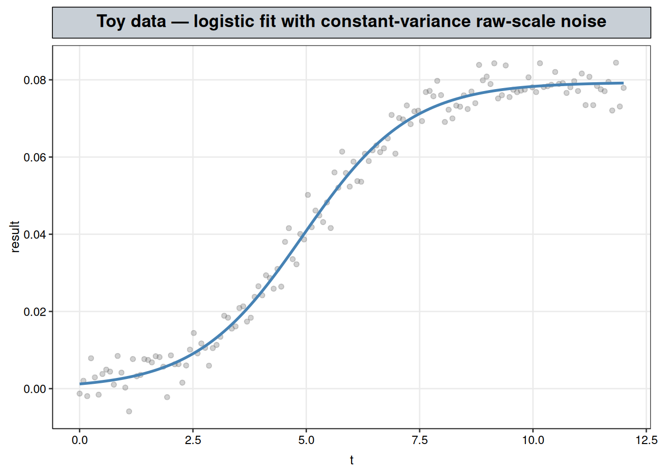
The diagnostic failure above reflects a mismatch between this fit’s constant-variance assumption and how concentration data actually behaves (variance growing with the mean), not a defect in nls() or in fitting on the raw scale generally. A toy dataset makes that concrete: same logistic shape, same sample size, but with noise added directly on the raw scale at constant variance, rather than the multiplicative noise real concentration measurements produce.
toy <- toy |>mutate(fit =predict(fit_toy))ggplot(toy, aes(t, result)) +geom_point(alpha =0.3, color ="grey40") +geom_line(aes(y = fit), color ="steelblue", linewidth =1) +labs(title ="Toy data — logistic fit with constant-variance raw-scale noise",x ="t", y ="result" ) + nlt_theme
Both tests pass here, on the raw scale, with no transform anywhere: Breusch-Pagan does not reject constant variance (\(p = 0.86\)), Shapiro-Wilk does not reject normality (\(p = 0.77\)), and confint() on Asym comes back directly in the same units as the response — no exp(), no back-transform, no Jensen’s-gap caveat. The tight scatter around the fitted curve above, compared to the wider, more variable spread in the Total Phosphorus plot further down this page, is the same constant-vs-growing variance difference the diagnostic tests are picking up on, made visible.
The difference between this toy fit and the Total Phosphorus fit above is the world the data came from, not the method. Additive, constant-SD noise on a raw concentration scale isn’t how real water-quality measurements behave: dilution, instrument precision, and detection-limit effects all scale with the concentration itself, which is exactly the multiplicative noise this vignette’s synthetic Total Phosphorus data was built with (see R/generate_synthetic_data.R). This toy example demonstrates that the raw-scale route can work cleanly, just not for data that looks like this analyte, rather than offering a better way to fit the same problem.
3.2 Where this sits in the transformations toolkit
Transformations lays out three ways to correct a model that doesn’t fit as given: transform the response, feature-engineer the regressor, or change the link function (paired with a matching noise family). This chapter’s diagnostic failure isn’t fixed by the first two, and only partially reachable by the third.
Feature-engineering the regressor doesn’t apply here. That correction fixes a systematic component that’s the wrong shape while staying linear in its parameters — a hinge term lets lm() bend at a single knot, for instance. A rise-then-plateau isn’t reachable that way; it needs a smooth, continuous mean function, not one extra linear piece. The logistic curve here is a parametric alternative to their local-averaging flexibility, distinct from a step back into feature engineering.
Transforming the response was available and deliberately not taken. Needing a back-transform to become a reportable concentration again leads to the same Jensen’s-gap bias Transformations raises for the Gamma-GLM comparison. This chapter chose interpretability over the variance-stabilizing property the log scale provides, and the diagnostics above are that choice’s cost made visible.
The link/family correction would actually fix this without giving up the raw scale, but it isn’t available from nls() as fit here. The failure pattern above is the same one Transformations’ Gamma-GLM section describes: concentration variance scaling with the square of the mean rather than staying constant, which a Gaussian fit can’t represent regardless of how well its mean function tracks the data.
That section’s fix — a log-link, Gamma-family GLM — is specified for a linear predictor, \(\log(E[Y\mid X]) = X\beta\). Asym, xmid, and scal don’t enter linearly, so the same fix here would mean fitting a generalized nonlinear model — this logistic mean function paired with a Gamma-like variance structure (e.g. nlme::gnls() with a power-of-the-mean variance function) instead of nls()’s implicit constant-variance Gaussian errors.
This chapter deliberately doesn’t take that step — the point here is what a three-parameter commitment can and can’t deliver on its own, CI caveats included — but it’s a real option, picked up in Extending this analysis below.
4 Results
With the fit made and its limits established, here is what it actually produces: a curve to compare against k-NN and LOESS, and three named quantities to report.
4.1 The fitted curve against k-NN and LOESS
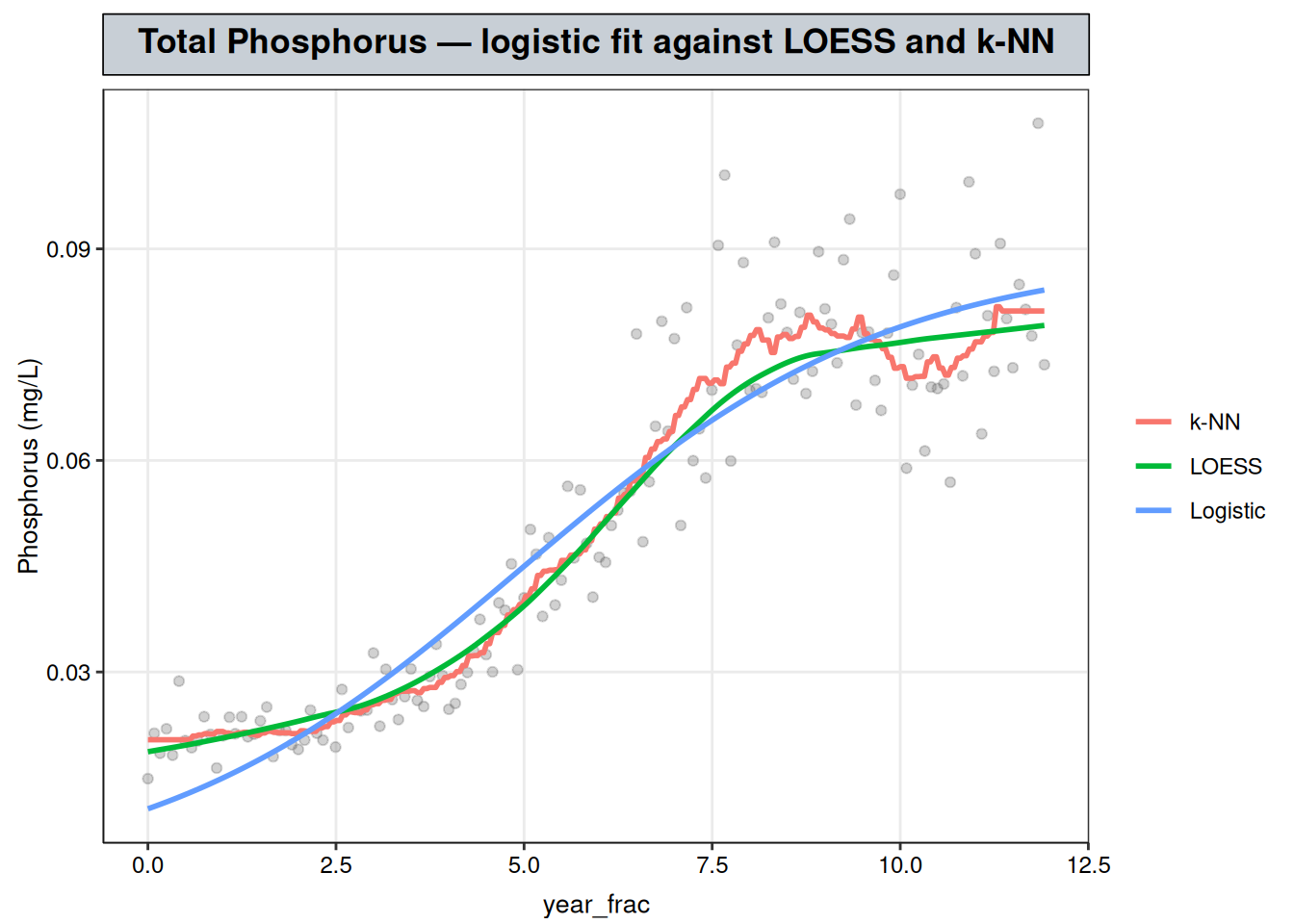
grid <- grid |>mutate(logistic_fit =predict(fit_logistic, newdata = grid))compare_all_df <- grid |>select(year_frac, LOESS = fit, `k-NN`= knn_fit, Logistic = logistic_fit) |> tidyr::pivot_longer(c(LOESS, `k-NN`, Logistic), names_to ="method", values_to ="fit")ggplot() +geom_point(data = tp_wq, aes(year_frac, result), alpha =0.3, color ="grey40") +geom_line(data = compare_all_df, aes(year_frac, fit, color = method), linewidth =1) +labs(title ="Total Phosphorus — logistic fit against LOESS and k-NN", y ="Phosphorus (mg/L)", color =NULL) + nlt_theme +theme(legend.position ="right")
The logistic curve tracks the same rise-then-plateau shape as k-NN and LOESS, though not exactly: a visibly close fit rather than an identical one.
At the start of the record it sits below both local curves, since the logistic form commits to a single floor asymptote where the local fits are free to follow whatever the earliest points happen to do. Through the transition and plateau it runs a little above them instead, because a three-parameter curve can’t reproduce every local wiggle the local fits pick up — it’s fitting one global shape, not a sequence of local averages. Those gaps are small relative to the record’s range, but they’re the visible cost of the parametric commitment: LOESS and k-NN chase the data wherever it goes, while the logistic curve can only bend the three ways Asym, xmid, and scal let it.
Phosphorus plateaus at an estimated 0.089 mg/L (95% CI 0.083–0.097), reached around year_frac ≈ 5 (95% CI 4.49–5.58) — roughly five years into the twelve-year record — with a transition scale (scal) of 2.47 years (95% CI 2.09–2.97) governing how gradually the curve bends from its low starting level onto that plateau. As the diagnostics above established, treat the point estimates as the reliable part of this and the CI widths as approximate.
5 Interpretation
This chapter set out to do more than describe a shape: the goal was inference — numbers with defensible uncertainty attached, not just a curve that tracks the data well.
The diagnostics above show that goal wasn’t fully met — the confidence intervals on those three numbers turned out to rest on assumptions (constant variance, normal errors) the data doesn’t satisfy. Even so, this doesn’t put the analysis back where LOESS and k-NN started. Even with the CIs discounted, there are still three named, reportable quantities to hand to a decision-maker, which a purely local fit cannot produce regardless of how well it tracks the data. A parametric commitment can fail informatively, in other words; a local fit with no coefficients can’t fail at all, because it never claimed anything precise enough to be wrong.
This isn’t available for every series, though — Generalized Additive Models, next, covers Total Copper’s step-and-spike pattern, which doesn’t resolve into any recognizable parametric family, so the flexibility has to stay in the model itself rather than being handed off to a curve like this one.
6 Extending this analysis
The diagnostic failure here is the same additive-vs-multiplicative noise mismatch described above — concentration data’s variance naturally grows with its mean, meaning a Gaussian fit to the raw scale is the wrong noise model rather than evidence that the shape itself is wrong. The natural extension, laid out there, is a generalized nonlinear model: the same logistic mean function paired with a Gamma-like variance structure (nlme::gnls() with a power-of-the-mean variance function) in place of nls()’s implicit constant-variance Gaussian errors. That would let Asym keep its mg/L interpretability while giving the confidence intervals the calibration this chapter’s diagnostics show they currently lack — the fully-corrected version of this fit, rather than the three-parameter-commitment-on-its-own-terms version this chapter deliberately stops at.